Meta has arrived with Muse Wonder, and the claims are bold. Its launch positions Muse Wonder ahead of GPT-6.1 Sol, while Muse Wonder Full supposedly beats Fable 5.1 and GPT-6 Astra. That sounds impressive. I wanted to find out what those claims meant for actual projects.
I tested Muse Wonder Full, its strongest version, across six builds on my machine. These weren’t simple landing pages or small coding exercises. I asked it to create a flood simulator, an open-world driving game, a Canva-style design studio, a bike shop website, a Blender kitchen design package, and a launch film made in code.
For each project, I gave the same prompt to a competing model. The comparisons used Claude Sonnet 5.5, GPT-6 Astra, and GPT-6.1 Sol. I ran Meta’s model through the $50-per-month Muse Code Power Usage plan.
The results were disappointing overall, although one project was genuinely competitive. Muse could build working features. The problem was the gap between including a feature and delivering something that felt convincing, usable, and finished.
There was another issue, too. Muse Code repeatedly stalled during safety checks. That affected the build process, the time spent, and sometimes the token usage. So this test became a comparison of both the AI model and the tool used to run it.
How I Compared the AI Coding Models
I wanted the same brief to produce comparable starting points. Each head-to-head used an identical prompt, rather than giving one model extra guidance after seeing what another had built.
These were single-prompt builds, but that doesn’t mean they completed instantly. The coding agents could work through the task over an extended period. In the flood simulation test, for example, both agents used their applications’ goal modes and spent more than an hour building.
I assessed the projects through practical use. A button labeled “remove background” doesn’t prove that background removal works. A flood wall doesn’t mean much if water behaves exactly as before. The useful test is what happens after I interact with the application.
My comparisons focused on four areas:
- Working features: Did the build carry out the main tasks in the brief?
- Usability: Could I operate it without fighting the controls or layout?
- Visual quality: Did the interface and generated assets look credible?
- Build efficiency: How much time and how many tokens did the process consume?
Tokens are the units an AI system uses to process and generate text. They’re useful for comparing how much work a coding agent performs, although token counts alone don’t tell me whether the result is good.
I also used Opus 5.5 as an AI judge. It assessed the builds against the specifications and certain tests. That gave me another perspective, but I didn’t treat its scores as the last word. Some projects met enough requirements to earn a reasonable score while still feeling poor in use.
Meta’s Muse Wonder announcement provides the background to the launch claims. My focus here is narrower: what I actually got from these six projects.
1. Flood Simulator: Muse Wonder Full vs Claude Sonnet 5.5
The first brief asked for a flood simulator for a town in Ireland. It used real elevation data to represent the terrain, buildings, and river. I wanted to simulate different flood scenarios, including one-in-20-year and one-in-100-year events.
The important interactive feature was barrier placement. I needed to draw flood defences, rerun the simulation, and see whether those changes protected buildings. That tests more than the ability to draw a town in 3D. It tests whether the controls connect meaningfully to the simulation.
Muse’s town looked flooded before I started
Muse’s version looked blocky. Some buildings appeared to sit underwater even before the flood began, which made the initial state difficult to interpret.
After I started the one-in-100-year scenario, the application marked flooded buildings in yellow. That feature existed, but the results raised questions. Several highlighted buildings didn’t seem to have any visible water around them.
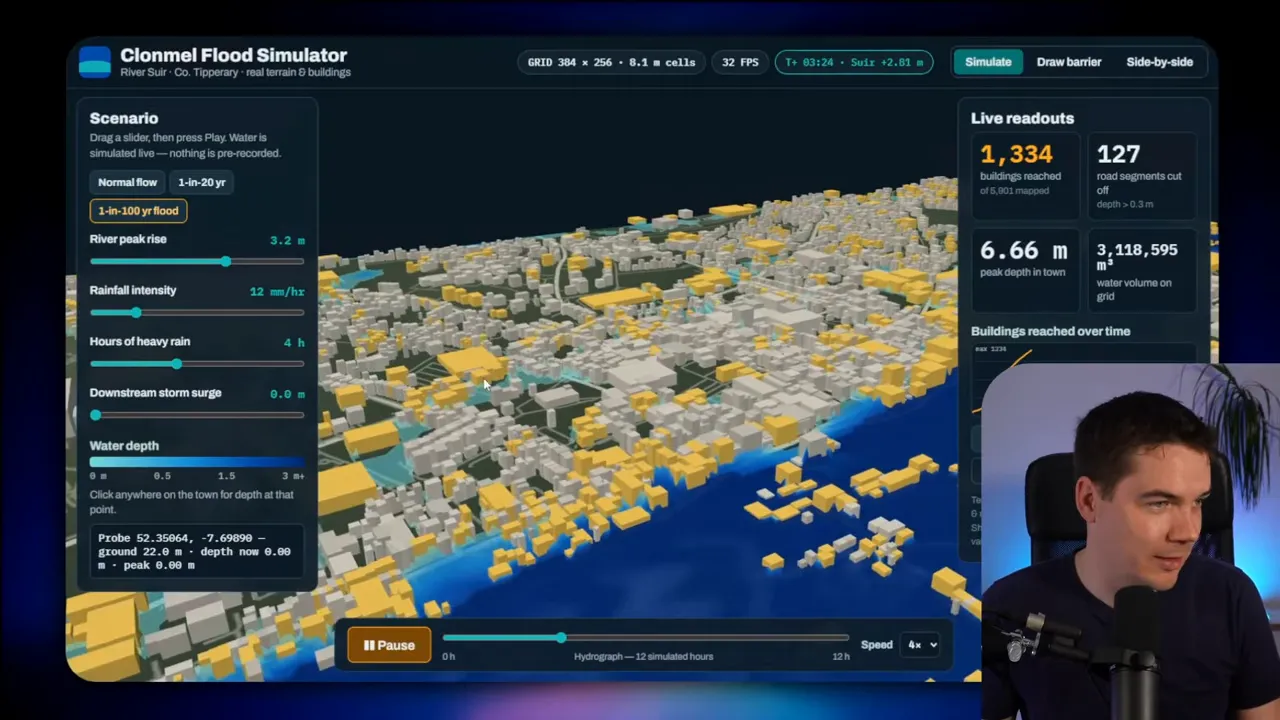
I then drew a barrier around one building. The camera controls made that awkward, but I managed to create what looked like a complete enclosure. After rerunning the flood at higher speed, the building still registered as flooded.
That didn’t give me confidence in the barrier feature. I couldn’t establish the exact cause from that interaction alone. Still, the application wasn’t communicating a clear relationship between my flood defence and the outcome.
Claude produced a clearer, more detailed simulation
Claude Sonnet 5.5’s version immediately looked higher resolution. Buildings didn’t appear submerged at the start, and the river was easier to follow through the town.
I increased the river flow, added heavy rain, and introduced a downstream storm surge. The river then began breaking its banks. Clicking the terrain showed information such as water depth and flow rate.
Some inland buildings also registered as affected. I couldn’t fully explain those results either. Local rainfall might have contributed, but I didn’t verify that. Claude’s build therefore wasn’t free from uncertainty.
The simulation ran on the graphics card. I could replay calculated states, but I couldn’t jump ahead before the GPU had processed them. That made the simulation’s progression more tangible than a simple prebuilt animation.
Next, I drew a three-metre flood wall around an island. The higher detail made placement easier. A few buildings still flooded, but the wall appeared to hold back much of the water while the surrounding river spread well beyond its banks.
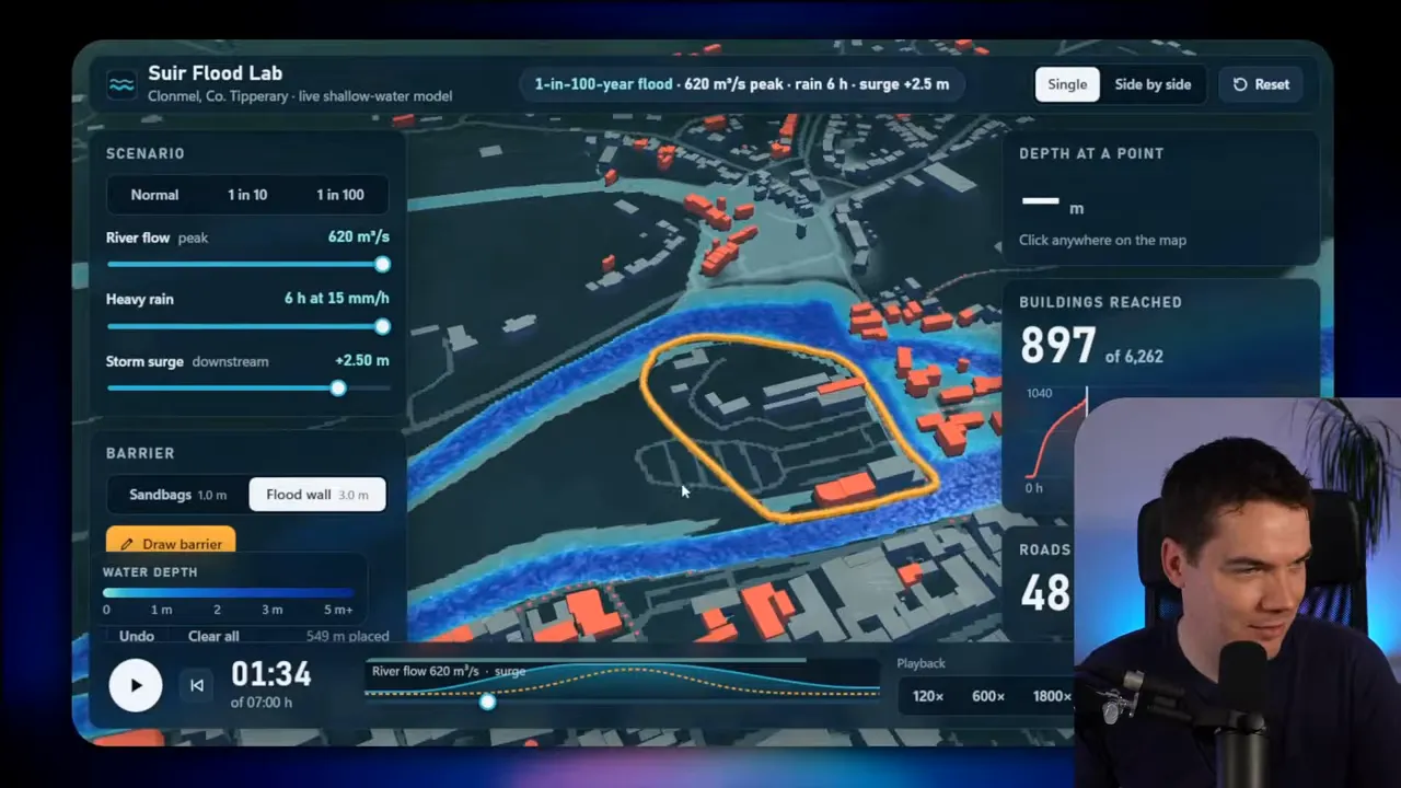
The automated judge called a tie. I preferred Claude.
Both applications used plain JavaScript, Three.js, and WebGL. Those tools let a browser display and run interactive 3D scenes.
The builds took roughly 65 and 73 minutes. Claude consumed almost three times as many tokens as Muse. Opus found strengths and weaknesses in both simulations and called the comparison a tie.
My choice was Claude Sonnet 5.5. Its higher detail, clearer starting state, and more convincing barrier behaviour made it the better application to use. Muse’s lower token usage mattered, but it didn’t outweigh those differences.
2. Westport Driving Game: Muse Wonder Full vs GPT-6.1 Sol
The next project was an open-world driving game set on the streets of Westport. The brief included a driving examiner that recorded faults, produced a pass-or-fail report, and supported a replay.
This was a useful test of basic interaction. A driving game can have an attractive menu and a detailed fault log, yet remain unusable if steering and collisions don’t work.
Muse failed at the controls
I started the driving test and accelerated with the up arrow. Almost immediately, the car passed through buildings. Then I discovered the bigger problem: the left key turned right, and the right key turned left.
That made the game extremely difficult to control. I lost track of the intended route while the application recorded speeding and other infractions. The fault system was doing something, but the driving itself wasn’t dependable.
The environment also looked repetitive. Buildings appeared almost identical, and trees stood in the water. Reverse worked, and the build included a small map, but those features couldn’t rescue the core experience.
I ended the test without waiting for the report. A driving simulator needs predictable steering before its examiner can provide useful feedback. In this build, the most basic part of the brief needed repair.
Sol’s version was imperfect, but actually usable
GPT-6.1 Sol’s opening screen had some odd shimmering in the road network. It did, however, offer practice and free-driving modes, with daylight, dusk, and rain options.
Once I started driving, the difference was obvious. Left meant left. Right meant right. That sounds like a low bar, but Muse hadn’t cleared it.
The town included recognizable Westport features, including the central pillar. I also encountered another vehicle. Collision detection stopped the car when it hit an obstacle, rather than allowing it to travel straight through.
There were still problems. A tree grew out of the road. Reverse didn’t behave consistently unless I was stuck against a building. I also hit a pedestrian, which the examiner recorded as a serious collision.
Sol added different camera views, including an in-car perspective with rearview and side mirrors. Those details made the build feel more complete.
The replay made the examiner useful
After ending practice, I could review individual incidents and inspect the route on a map. The report connected recorded faults to moments in the drive. That’s much more useful than displaying a total number of mistakes.
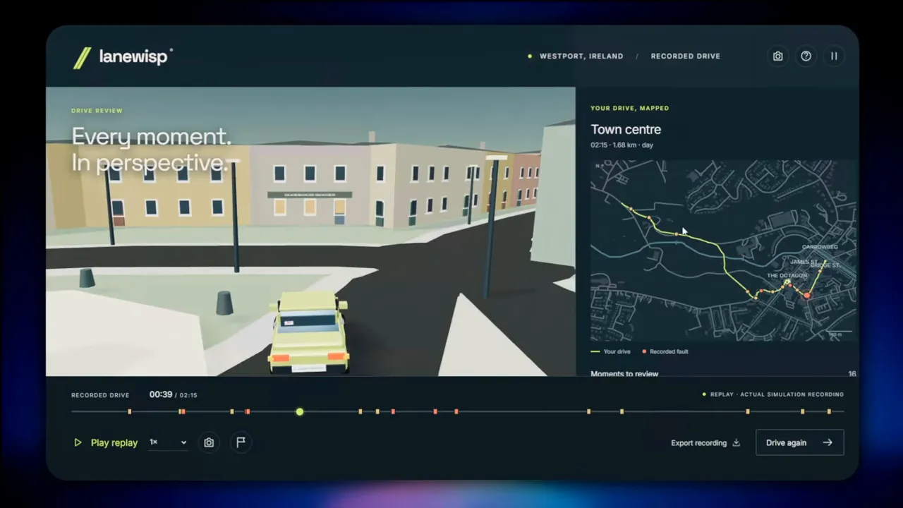
Opus scored GPT-6.1 Sol at 7 out of 10, compared with Muse’s 3 out of 10. That matched my experience. Sol still needed fixes, but it provided a workable foundation. Muse needed changes to steering and collision behaviour before the rest of the game could really matter.
3. Canva-Style Design Studio: Muse Wonder Full vs Claude Sonnet 5.5
The third brief asked for a Canva-style design studio for a café. The café’s brand needed to come built in, along with templates and tools for editing designs.
This was Muse’s strongest comparison. Both models produced applications with a surprising amount of functionality from a single prompt.
Muse built a useful café design editor
Muse created a studio for a fictional brand called Ember and Rye. I opened a sourdough promotion and tested the editor. Selecting, moving, resizing, and cropping elements worked.
The application also included elements, layers, and a brand kit. A brand kit keeps the café’s visual identity available inside the editor, rather than making each design start from scratch.
Local AI background removal was another feature. I tried it on an image, and it produced a recognizable result. I wouldn’t describe the quick test as proof of perfect cutouts, but the function did more than display a decorative button.
Resizing a design into several formats also worked at a basic level. The application showed the different versions and let me add them as pages. A selector at the bottom then let me move between those pages.
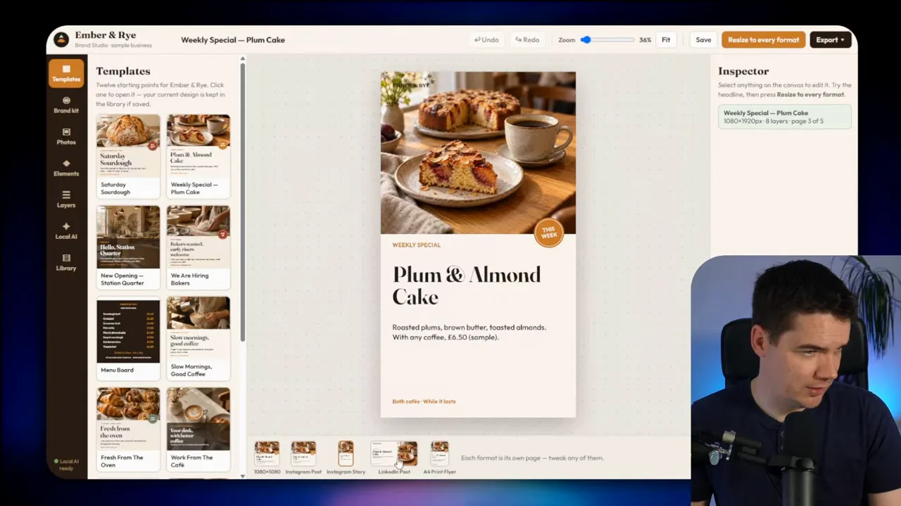
I finished by exporting a full-resolution JPEG. Taken together, those actions formed a useful workflow: choose a template, edit it, adapt its format, and export the result.
Claude offered a different structure with similar capabilities
Claude Sonnet 5.5 began with an overview page. From there, I could open a design and enter the editing layout.
Inside the editor, I moved elements, changed text, and used undo. The template library included filters. Claude also supplied the required brand kit, design elements, and AI-generated photography.
Background removal worked in my test. Its “magic resize” feature produced alternative formats, too. Both models had therefore implemented much of the same practical workflow.
The difference here was much smaller than in the driving game. I wasn’t comparing a broken core interaction with a usable alternative. Both studios let me carry out the main editing tasks.
A close result rather than a decisive loss
Execution time and token consumption were roughly similar. That comparison included another Muse Code stall involving its safety classifier.
Opus gave Claude the marginal advantage because it passed more specification-based tests. My own impression was that the two builds were fairly even. There wasn’t a large enough practical difference to justify treating this as a clear failure for Muse.
The café design studio showed that Muse Wonder Full can produce a credible interactive application. Editing, background removal, resizing, and export all had working implementations. It was the strongest evidence in these tests that Meta’s model could compete with an established alternative.
That also made the weaker projects more revealing. Muse wasn’t unable to build software. Its performance varied substantially depending on the task and the quality expected from the finished result.
4. Bike Shop Website: Muse Wonder Full vs GPT-6 Astra
The bike shop brief combined visual ambition with a practical business feature. I wanted a bicycle in the opening section to assemble as I scrolled. The site also needed a booking engine that worked.
I’m not especially fond of 3D hero sections like this. Still, it was a useful challenge. The model had to coordinate a scroll-driven animation, build a coherent website, and support a booking journey.
Both models received text prompts only. I didn’t provide reference images for them to recreate.
Muse included the requested animation, but it looked basic
Muse invented Kilronan Cycles. As I scrolled, the bicycle’s frame, wheels, and other components moved into place.
The requested behaviour was present. The visual quality was another matter. Basic shapes, cylinders, and rings made the bicycle look crude, and the opening arrangement looked awkward.
The rest of the website was fairly small. Some AI-generated images appeared distorted, including imagery on the shop’s story page. An embedded map worked, but the overall presentation lacked polish.
The booking interface was more successful. It offered service options, dates, available slots, and a form. I could submit the booking and reach a confirmation page.
That confirmation also referred to an email. I couldn’t verify email delivery because the application ran in a sandbox. A confirmation screen demonstrated the interface flow, not a proven live email service.
Astra built a more complete shop experience
GPT-6 Astra’s version looked much cleaner. Its opening bicycle arrangement was still strange, but the assembly animation joined the parts more convincingly. The rendering also had more detail.
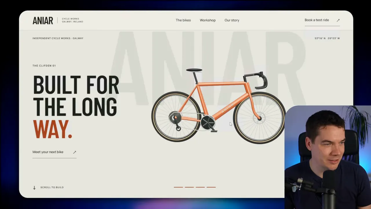
Further down the site, product cards linked to individual bicycle pages. That gave the application more of an e-commerce structure than Muse’s version.
The workshop booking process was stronger as well. Instead of placing the whole interaction into a basic form, Astra guided me through a sequence of steps. The layout made service selection and scheduling feel more deliberate.
That’s an important distinction. Two sites can both contain a booking form, yet differ greatly in how easy the booking is to complete. Astra’s build combined a clearer journey with a more consistent visual presentation.
More time didn’t produce a better result for Muse
Muse’s build took longer and used more tokens. Repeated safety-classifier timeouts contributed to that. I suspected heavy service load, but I couldn’t confirm the cause.
Codex didn’t encounter the same issue in this comparison. Astra therefore delivered the better site without the same disruption to its build process.
My winner was GPT-6 Astra. Muse implemented the main ideas, but Astra produced a more polished website, stronger product pages, and a better booking flow.
5. Blender Kitchen Designer: Muse Wonder Full vs GPT-6 Astra
The kitchen project pushed beyond an ordinary web application. I supplied a real kitchen measured down to the centimetre. Each model had to act as a kitchen designer, model the room in Blender, and create three different styles.
The brief also called for photorealistic renders, fly-through animations, and pricing. That meant the output needed to connect a measured room, a 3D model, a presentation interface, and a parts list.
Astra connected the design and presentation well
GPT-6 Astra created a landing page with the room and three style options. It included daylight and golden-hour lighting, plus four viewing angles.
The floor-plan page showed the kitchen’s working triangle. That represents the relationship between the main working areas, rather than treating the kitchen as a collection of attractive cabinets.
There was a small text overlap in the plan interface. Astra’s result wasn’t flawless. However, the overall structure made the design package easy to understand.
I could also inspect the parts list and play fly-through videos. Opening the Blender file confirmed that an actual 3D room model existed behind the presentation.
The rendered camera movement gave a useful view of the kitchen. A three-way comparison then showed the different styles side by side.
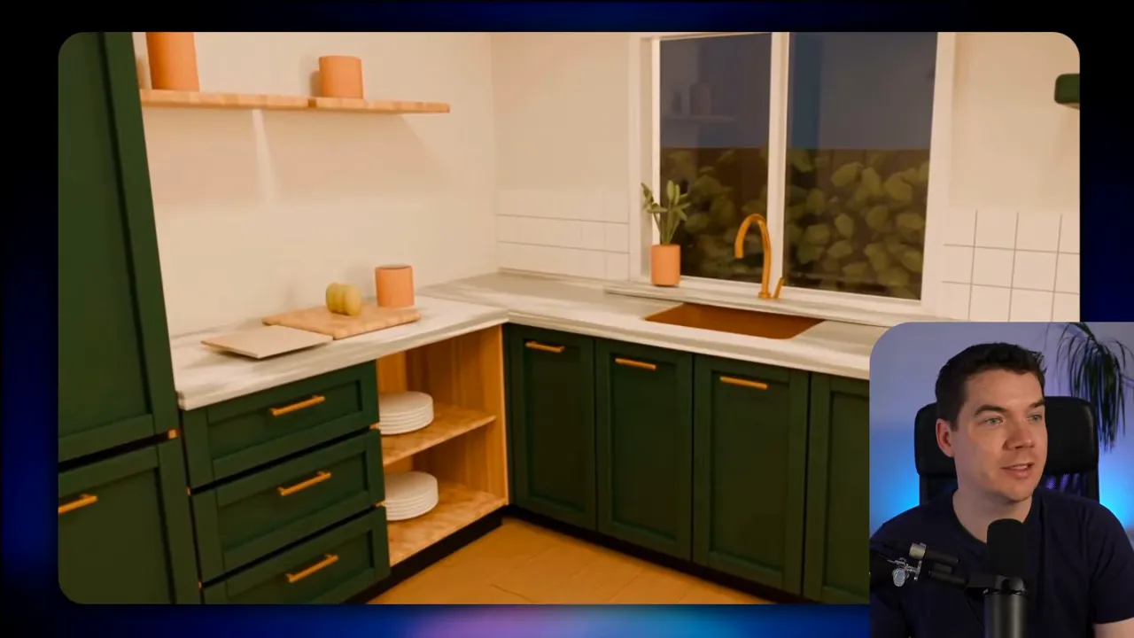
That combination was impressive. I could compare styles, inspect the plan, review costs, and see how the room looked from different positions. The interface supported the underlying design work instead of getting in its way.
Muse supplied many features, but the finish was weaker
Muse’s interface felt dated by comparison. It had pricing and style choices, though I initially found the style selection less clear.
Once I located the alternatives, I could switch between them and inspect a full parts list. The build also included daylight and evening versions, several viewing angles, a floor plan, and side-by-side reels.
The fly-through worked after I found the playback control. Yet the 3D model needed more attention. One feature that should have looked like a sink appeared closer to a flat steel sheet.
That kind of error matters in a kitchen design. If a main fixture doesn’t read clearly, the room loses credibility even if the application offers all the expected tabs.
The floor plan looked broadly similar to the intended layout. Muse therefore hadn’t missed the task entirely. It had delivered much of the package, but with weaker modeling and a less polished interface.
The scores were close, but the practical gap was clear
Opus scored Astra at 6 out of 10 and Muse at 5 out of 10. I agreed with the winner, though the quality difference felt larger than that one-point margin suggested.
Muse Code again stalled during safety checks. Those interruptions made the build slightly longer and increased the token usage needed to complete the process.
For this project, Astra gave me the better design presentation and more convincing 3D result. Muse offered functionality, but the room and interface both needed further work.
6. Launch Film Made in Code: Muse Wonder Full vs GPT-6.1 Sol
The last brief asked for a 60-second launch film for an open-source financial application. The film needed to use real application screens and be built from code.
This tested visual composition and animation. A model could include screenshots and moving text while still producing something that felt like a basic slideshow.
Muse’s film lacked polish
Muse used the application screenshots, but some were cut off. The film didn’t properly fill the available screen area either.
Its animation relied on basic fades, pop-outs, and changes in container size. Those techniques can work, but the result here didn’t feel especially considered. The movement didn’t compensate for weak framing and presentation.
I wanted a launch film, not simply evidence that code could make screenshots move. Muse’s version was a starting point that would need substantial visual revision.
Sol improved the presentation, without solving everything
GPT-6.1 Sol’s version included audio. It also had a nicer layout, cleaner design, and better transitions. The application screens looked more like part of a coherent product presentation.
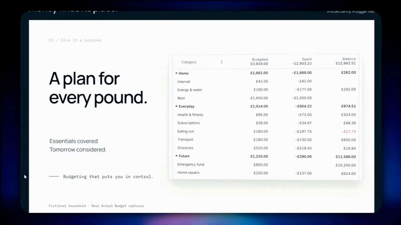
There were still issues in the walkthrough, and the overall animation felt flat. Neither model produced a particularly compelling launch film.
Opus called the result close, scoring Muse at 5 out of 10 and Sol at 6 out of 10. My personal scores would have been nearer 2 and 3. The automated assessment seemed more generous than the creative result deserved.
Sol was the better starting point. Its layout, audio, and transitions gave it the advantage. That doesn’t mean I’d treat the film as finished.
The subject matter was fairly dry, but that wasn’t enough to explain the outcome. A financial application can still receive a thoughtful motion-graphics treatment. I suspected Astra or Opus might do better, though I didn’t test them on this brief.
What Muse Code’s Reliability Problems Meant for the Test
The repeated safety-classifier stalls deserve their own attention. They weren’t the same as the model generating weak code or poor visual assets.
Muse Code is the coding environment around the model. It helps the agent work through a project and carry out actions. That surrounding tool affects the experience just as much as the model’s reasoning does.
During these builds, safety checks sometimes hung or timed out. I had to restart projects on several occasions. The interruptions affected the café studio, bike shop, and kitchen workflows, among others.
This creates two separate questions:
- How good was the generated application? That depends on the code, design decisions, assets, and implemented behaviour.
- How dependable was the build process? That depends on whether the coding environment lets the agent complete its work consistently.
Muse struggled on both fronts in this test. Some completed applications were clearly weaker than their competitors. In other cases, the surrounding tool made completion slower and more disruptive.
I don’t know whether those stalls came from temporary launch load or another issue. Meta may resolve them. For now, I can only assess the process I experienced.
The time and token figures need that context. Higher usage doesn’t automatically mean a model reasoned more deeply about the task. Here, stalled checks contributed to additional work without improving the finished application.
Why I’m Keeping My OpenAI and Claude Subscriptions
Across these six projects, Muse Wonder Full didn’t give me a reason to replace my existing tools.
| Project | Competing model | My assessment |
|---|---|---|
| Flood simulator | Claude Sonnet 5.5 | Claude offered clearer detail and more convincing behaviour. Opus called a tie. |
| Westport driving game | GPT-6.1 Sol | Sol won clearly. Muse’s steering and collision problems undermined the game. |
| Café design studio | Claude Sonnet 5.5 | Close in practical use. Opus gave Claude a small advantage. |
| Bike shop website | GPT-6 Astra | Astra delivered better design, product pages, and booking flow. |
| Blender kitchen designer | GPT-6 Astra | Astra produced a more convincing model and presentation. |
| Launch film | GPT-6.1 Sol | Sol was more polished, but neither result was strong. |
The café design studio was the main exception to an otherwise weak showing. It demonstrated useful editing features and competed closely with Claude. Elsewhere, Muse often delivered the requested feature list without matching the quality of the alternative.
These six projects don’t measure every possible use of Muse Wonder. They do show why I wouldn’t base a subscription decision on a launch ranking alone.
My practical standard is straightforward: the application needs to work, feel usable, and justify the effort spent building it. Better benchmark claims don’t fix reversed steering, unclear flood results, or poorly framed screenshots.
Based on these results and the repeated Muse Code interruptions, I’m keeping my OpenAI and Claude subscriptions. I’d likely cancel the $50 Muse subscription at the end of the month. Meta could improve the model and its coding environment, but this version hasn’t earned a place in my regular workflow.