I tested Google’s Gemini 4 Argon against Claude Opus 5.5 on six projects, from a Canva-style editor to a fully rendered kitchen in Blender. I wanted to find out which model could turn a detailed brief into something useful, rather than something that simply looked impressive at first glance.
The difference became clear quite quickly. Argon often included the requested features, but wrapped them in cluttered, technical interfaces. Opus usually produced a more coherent experience. Neither model escaped without bugs, and some of those bugs were serious.
Across the five projects with reported numerical scores, Opus won every comparison. It also produced my preferred Blender kitchen. That doesn’t mean every Opus build was ready to use. The driving simulator, in particular, showed why a winning score still needs a careful human check.
Here’s what worked, what broke, and what the results tell me about choosing an AI model for a real project.
How I Compared Gemini 4 Argon and Opus 5.5
Google positions Argon as its new flagship model, with a focus on solving difficult problems. Its Gemini 4 Argon announcement sets out that ambition. I wanted to test it through complete builds rather than isolated coding questions.
At the time of my tests, Argon was available through the Gemini web app, Google AI Studio, and Google Anti-Gravity. I used the Google Anti-Gravity CLI, its command-line environment. Access required the AI Ultra plan, so I signed up for the $99 monthly plan to run these comparisons.
I gave both models the same briefs and set their reasoning effort to high. Each project had a time limit. GPT-6 Astra then reviewed the results against the requirements, and I tried the finished builds myself.
That gave me two useful perspectives:
- Requirement coverage: Did the model deliver the features described in the brief?
- Practical usability: Could I actually use those features, and did the result make sense for its intended audience?
Those aren’t always the same thing. A design editor can include text controls without making text easy to edit. A simulator can display a town without representing its streets convincingly.
There are also limits to the comparison. I asked Opus to repair a major performance problem in the flood simulator. Argon hit a five-hour usage limit during some later work, which interrupted progress and complicated the timing figures. These are practical build tests, not a claim that every task ran under perfectly controlled laboratory conditions.
1. Flood Simulator: Working Barriers, Unfinished Towns
The first brief asked for a flood simulator based on Clonmel, a real river town in Ireland. I wanted to simulate different flood conditions, add protective barriers, and compare the results.
Both models built their applications with Three.js and TypeScript. In simple terms, they created interactive 3D scenes in the browser, with code controlling the water, buildings, barriers, and interface.
Argon’s version
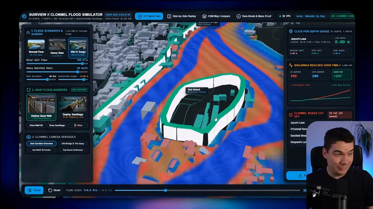
Argon produced a recognizable version of Clonmel. The water effect looked good, and the application offered several useful controls. I could switch between heavy rainfall and a 100-year surge, change camera angles, inspect water depth, and track buildings affected over time.
Its sandbag protection had a visible effect. Under heavy rainfall, it reduced flooding quite effectively. A larger surge overwhelmed more of the town.
The problems appeared as I explored. Buildings looked blocky, and some seemed only partly formed. Certain buildings were already underwater before I started the flood. The playback controls also made it difficult to establish a clean starting point.
Barrier placement needed work. Adding a quay wall created an enormous structure along the town, towering above nearby buildings. Other walls appeared to have gaps. A wall I’d cleared also seemed to return.
Still, the core interaction worked in the demonstration. Barriers could hold back water and protect buildings. Argon also included a side-by-side replay, an OpenStreetMap comparison, and information about roads cut off by the flood.
Opus’s version
Opus gave me a cleaner interface, with separate live, barrier, and comparison modes. Its town model remained crude, though. Buildings looked unfinished, the bridge was missing, and part of the river appeared incomplete around an area that includes a weir on the real map.
Performance was the bigger immediate problem. The simulation ran incredibly slowly, even on my RTX 5090. I asked Opus to fix it before continuing. After that repair, the faster mode made the simulation practical to test.
Flood behavior still raised questions. Some buildings registered as flooded despite appearing far from water. Another seemed underwater before the simulation began.
My first attempt to protect the island failed. After adjusting the wall, I could save the buildings. The side-by-side comparison then showed the useful distinction: the unprotected version flooded, while the protected version stayed clear.
Opus scored 7/10, compared with Argon’s 5/10. Argon took 74 minutes, while Opus took 54 minutes. Opus used roughly two and a half times as many total tokens, but much of that usage came from cached input. Their output token counts were similar.
I’d call both promising prototypes. Neither demonstration establishes that its flood behavior matches real conditions. For this coding test, though, Opus completed more of the brief in less time.
2. Canva Clone: Features Matter Less If the Editor Is Hard to Use
Next, I asked both models to create a Canva-style design application with a complete bakery brand built in. The brief included templates, brand assets, local AI background removal, and quick resizing for different formats.
This was a useful test of product design. A design editor has to expose plenty of tools without making a simple task feel complicated.
Argon met key requirements but crowded the screen
Argon included templates, a brand kit, layers, and local AI tools. Its background removal worked quickly. Resizing also generated versions for formats such as Instagram posts and stories.
Those were meaningful successes. The application did more than display buttons that looked functional.
However, the interface felt much too technical. It exposed detailed position coordinates and a large number of controls. The typography added to that impression. I often struggled to work out where to look next.
Text editing was an example of the problem. Double-clicking the text didn’t let me change it directly. Instead, I had to edit through a separate panel. That’s possible to use, but it adds friction to one of the editor’s most basic actions.
Argon had built many of the ingredients. It hadn’t organized them into a comfortable editing experience.
Opus understood the workflow better
Opus started with a collection page rather than dropping me straight into the editor. I could browse bakery templates, choose one, and then open it. That felt much closer to the product the brief requested.
The editing screen also had a clearer structure. Templates, the brand kit, photos, and text tools were easier to find. I could move objects around without the interface demanding quite so much attention.
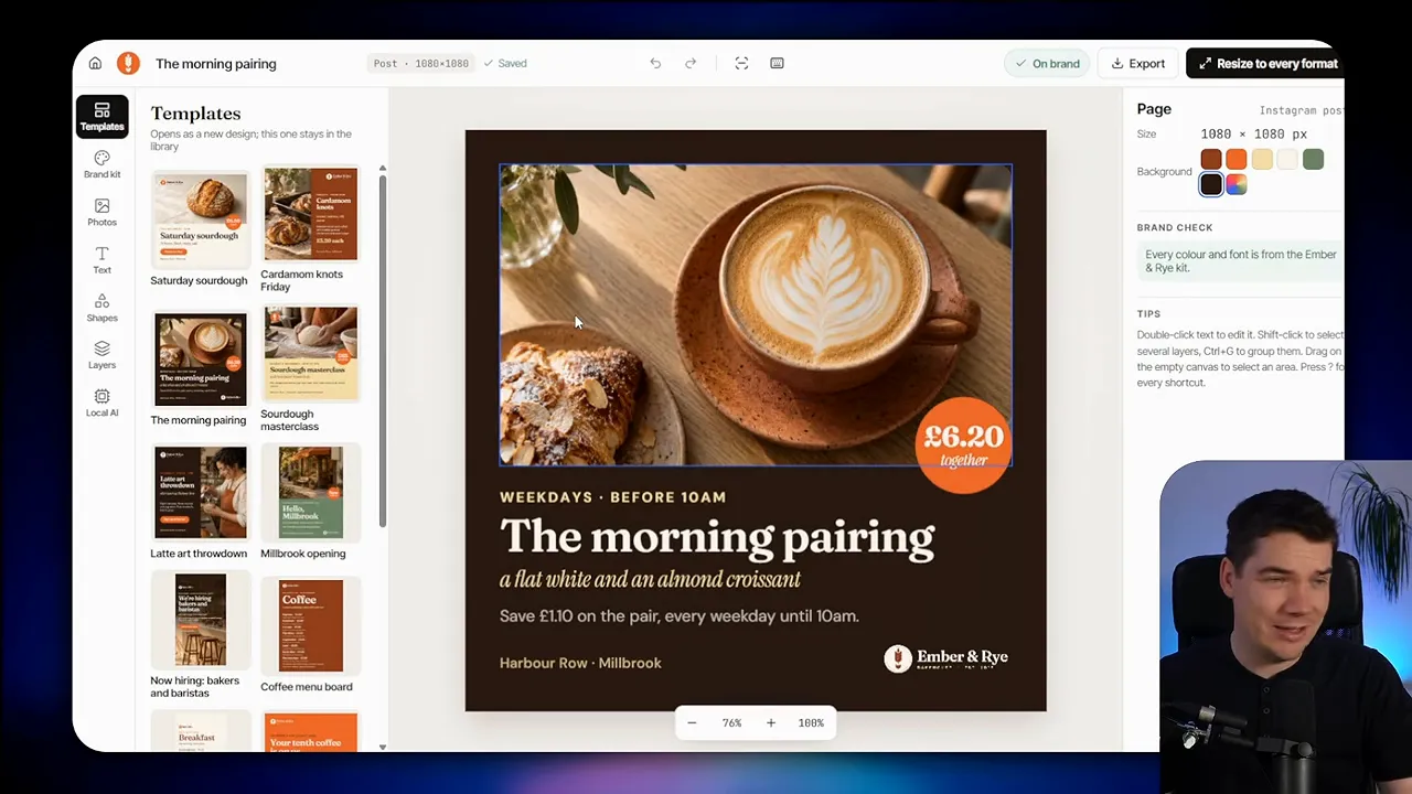
Text editing still wasn’t right. An attempt to edit in place appeared to add a new text box instead. Right-clicking opened the standard browser menu, rather than editor-specific controls.
Other interactions worked well. I could change alignment, add photos, remove an image background, and generate multiple sizes. The resizing screen let me open an individual format for further adjustments.
That last step mattered. Some resized text sat close to the edge, so automatic resizing didn’t remove the need for a quick layout check. It did give me a useful starting point.
Opus also offered PNG, JPEG, and PDF exports. I tested a JPEG export, and the file downloaded successfully.
The scores were 8/10 for Opus and 6/10 for Argon. Argon took almost twice as long, without hitting its five-hour usage limit during this exercise. Opus used more total tokens, again with substantial cached input.
For me, this result wasn’t just about visual polish. Opus put the tasks in a better order. Choosing a template, editing it, resizing it, and exporting it formed a more understandable workflow.
3. Premium Bike Shop Website: Understanding the Customer
The bike shop brief asked for a premium website with a 3D opening section. As someone scrolled, the bike should assemble itself. The site also needed a booking engine.
Both models attempted the requested animation. The bigger difference was whether the surrounding website felt like a place a customer would browse and book.
Argon made the site feel like a technical application
Argon’s opening section was busy. The bike assembled, but the presentation didn’t create the premium impression I’d hoped for. Dense text, technical details, and numerous controls competed with the main visual.
There were useful features further down the page. Product cards included reservation and test options. A 360-degree bike view was a nice addition. The booking engine offered three tabs, with choices for the service and date.
Yet the same problem kept appearing. Argon seemed to lose sight of the intended customer. Even the map felt technical. The site explained and displayed a great deal, but it didn’t make the buying or booking experience feel simple.
That’s an important distinction in AI website generation. Including a requested feature isn’t enough if its presentation pulls the whole site away from the brief.
Opus created a more convincing shop
Opus’s opening animation wasn’t perfect either. At the start, bike parts floated across the screen in a rather awkward arrangement. As I scrolled, however, they came together into a much more convincing assembled bike.
The rest of the site made better use of that introduction. It presented twelve bikes across a range, with category navigation, product pages, size choices, and reservation options.
Rather than feeling like a single overloaded page, it behaved more like an e-commerce experience. I could browse the range and inspect an individual bike without losing the structure of the site.
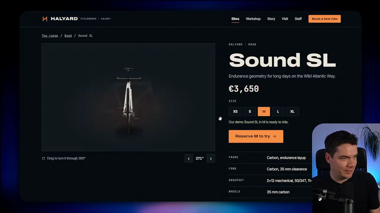
A full-screen image of Connemara added context. It showed the kind of place someone might explore on the bike, instead of filling the page with more specifications. A two-column workshop section, map, and opening hours helped the shop feel like a real business.
The booking flow was substantially better. It revealed choices step by step as I progressed. I could choose a service, select a time, provide details, and reach a booking confirmation.
Opus scored 8/10, while Argon scored 5/10. That matched my own experience. The difference was clear throughout the site, not just in the opening animation.
Argon took longer. Total token use was fairly even, but Argon recorded more new input tokens. I suspect the interruption from its five-hour usage limit affected prompt caching after the restart. That’s a possible explanation, rather than something I could confirm.
Of all the website tests, this one made the design gap especially obvious. Opus did a better job of turning the same requirements into a customer-facing product.
4. Driving Simulator: A Better Experience With a Serious Rendering Bug
For the driving test, I asked both models to build an open-world simulator based on Westport’s real streets. It needed a test mode that recorded faults for breaking road rules.
This combined several difficult tasks. The model had to represent the town, create drivable roads, handle traffic and pedestrians, and explain driving mistakes through the interface.
Argon’s town and collision behavior broke the experience
My Argon test began with another car driving through mine. That set the tone for the rest of the session.
Westport looked far larger than it should. Many buildings resembled tall, repetitive blocks. Road markings were strange, some areas lacked a clear road, and reversing didn’t work comfortably.
The most damaging issue was collision handling. I could drive through buildings. Traffic also behaved in ways that made the examiner’s fault reports difficult to trust. If another vehicle passed through mine, the resulting penalty didn’t provide useful feedback about my driving.
Argon did include several requested elements. There was a map, a live examiner report, rain, and different camera angles. The cockpit view even included mirrors.
Those features showed real effort, but they couldn’t compensate for the environment. A driving simulator needs dependable roads and physical boundaries before extra modes become valuable.
Opus improved the driving, but flickering remained
Opus made a stronger first impression. Its route-selection screen offered different test routes, and the driving environment looked much more convincing. Roads were visible and properly defined. The buildings also felt closer to a town streetscape.
Driving produced clear feedback for speeding, using the wrong side of the road, and collisions. An examiner provided route instructions. The car could slide during abrupt movements, which added a sense of physical behavior missing from the other build.
Building collision behavior appeared better during my test, although the short session wasn’t enough to verify every boundary. My driving itself certainly wasn’t a model of good practice.
The end-of-test report was one of the strongest features. It listed faults and placed them along the route, making it easier to connect a mistake with where it happened.
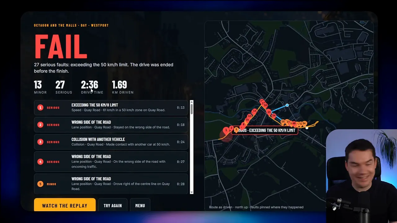
However, Opus had a significant flickering problem. I initially considered whether the browser rendering might be responsible. After checking with the model, it appeared to be a script bug. Some flickering continued during the drive.
Opus won by 6/10 to 5/10. This time, it took longer and used more input and output tokens.
The narrow score feels appropriate. Opus built the better simulator, but the rendering fault remained a major issue. I also don’t think the automated judge properly accounted for it. This is exactly why I wouldn’t rely on an AI-generated score without trying the application myself.
5. Blender Kitchen: Both Impressed Me, but Opus Added More Detail
The Blender task moved beyond browser applications. I wanted a real kitchen model in three distinct styles, with photorealistic renders, flythroughs, and a costed parts list.
Blender is 3D creation software. Asking for the actual project file matters because a polished image alone doesn’t show whether a usable 3D scene exists behind it. I opened both models’ files and explored the kitchens directly.
Argon delivered a strong set of kitchen designs
Argon produced three clear styles: deep green shaker, Scandinavian oak, and a dark modern kitchen with an island.
The green shaker version included four rendered viewpoints. I could see an exterior through the windows, which helped the room feel more complete. Argon also supplied a flythrough, a showreel, and a three-way style comparison.
Lighting options let me compare daylight with golden hour. Alongside the images, the project included the Blender file and parts costings.
Once I opened the file, hid a wall, and cleared the guides from view, I could inspect the island kitchen. The overall model looked good. Cabinets, worktops, decorative objects, and lighting came together into a convincing room.
A close look revealed a problem with the faucet. Part of it appeared to hang in midair. It was a small detail compared with the full scene, but a clear reminder that attractive renders can hide construction errors.
Even with that fault, this was one of Argon’s stronger results. I genuinely liked what it produced.
Opus’s kitchen felt more complete
Opus offered Heritage Green, Nordic Oak, and Graphite Handleless styles. Its first render looked remarkably realistic. The materials, lighting, and small objects gave the room more depth and detail.
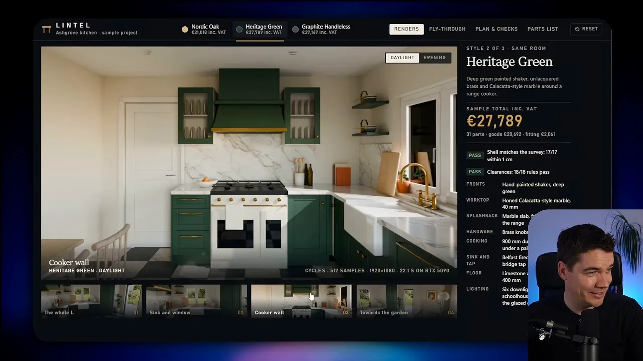
The lighting comparison also went a step further. Switching to evening changed the exterior seen through the windows, rather than leaving the outside scene looking unchanged.
Its flythrough included smooth pans and different angles around the kitchen. I could inspect the island and the working area between the main kitchen functions. The project also included a layout, survey plan, parts list, and PDF download.
Inside Blender, the detail held up. Wall tiles, flowers, shelving, and accessories were part of the scene. After enabling the rendered view and denoising, the kitchen looked excellent.
The exterior used AI imagery, which I could identify as I moved outside the room. That’s worth distinguishing from a fully modeled garden. It still worked well as a backdrop from inside.
I didn’t report a numerical judge score for this task. My preference was clear, though. Opus produced the more polished kitchen, while Argon delivered a respectable alternative. Both showed how much a model can now create in Blender from an initial brief.
6. Launch Film: Storytelling Beat Dense Information
The final brief asked for a 60-second, Remotion-style launch film for an open-source financial application. This meant creating the presentation through code, with animation, product footage, and versions for different screen shapes.
A launch film has a different job from a dashboard. It needs to communicate a message over time. Filling every frame with information can make the result harder to understand, even if all that information is relevant.
Argon repeated its cluttered approach
Argon supplied a launch-film interface, a horizontal film, and a vertical version. Unfortunately, the film shared the interface’s main weakness: too much small text.
There were basic movements and animations, background music, and sections showing the application. Several scenes left me unsure what I was meant to take from them.
The vertical version made the readability problem more noticeable. Producing another aspect ratio satisfied part of the brief, but it didn’t solve the underlying layout issue.
For this kind of deliverable, readability is part of functionality. Text that exists but can’t be comfortably read isn’t doing its job.
Opus gave the film a clearer story
Opus opened with a more focused idea about money slipping away, then introduced the app as a way to organize it. That gave the sequence a reason to move from one scene to the next.
Charts, text transitions, and application screens supported that story. The film pointed out parts of the product, showed its handling of payees, and included a mobile view before the closing message.
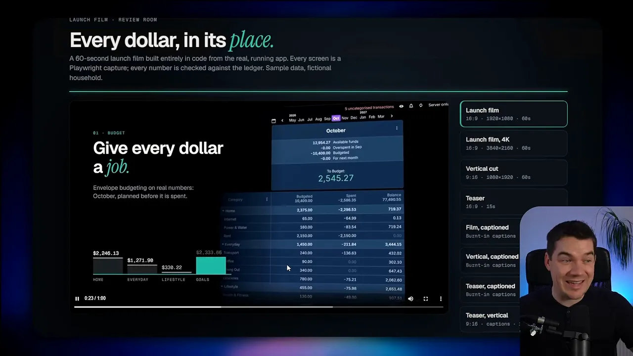
Its vertical version wasn’t immediately obvious from the surrounding interface, but I opened it separately and confirmed the 9:16 format.
Opus scored 7/10, compared with Argon’s 4/10. I preferred its presentation, although neither film was exceptional. Better use of animation component libraries could help both results, particularly with movement and transitions.
Argon hit its five-hour usage limit during this task and stalled. I’d therefore discount the elapsed-time comparison. Total token usage was broadly similar, while Argon generated more output tokens. The restart may also explain its larger amount of new input, if earlier prompt caching no longer applied.
The main creative difference was easier to judge than the usage figures. Opus selected a smaller number of ideas and presented them in sequence. Argon tried to show too much at once.
What the Scores and Build Times Actually Tell Me
The results consistently favored Opus, but the size and meaning of the win varied by task.
| Project | Gemini 4 Argon | Claude Opus 5.5 | My main observation |
|---|---|---|---|
| Flood simulator | 5/10 | 7/10 | Both had working barriers, but unfinished maps and simulation issues. |
| Canva-style editor | 6/10 | 8/10 | Opus organized the editing workflow more clearly. |
| Premium bike shop | 5/10 | 8/10 | Opus better understood the customer-facing brief. |
| Driving simulator | 5/10 | 6/10 | Opus improved the experience but retained serious flickering. |
| Blender kitchen | No numerical score reported | No numerical score reported | I preferred Opus’s detail and realism. |
| Launch film | 4/10 | 7/10 | Opus communicated through a clearer sequence of ideas. |
More tokens didn’t necessarily mean slower work
Several tests showed Opus using more total tokens while finishing sooner. Tokens are the units a model processes and generates. Total usage can include repeated input that the system has cached, so it doesn’t tell the whole story on its own.
I looked separately at total tokens, new input, and output. That made the comparison more informative. It still didn’t establish a complete cost comparison, especially with usage limits and restarts affecting some runs.
Usability was the most consistent difference
Argon’s recurring weakness was its tendency to make applications feel like technical control panels. The Canva clone, bike shop, and launch-film interface all showed it.
Opus more often understood what should appear first and what could wait. Its template gallery, step-by-step booking flow, and launch-film story all benefited from that judgment. The kitchen showed a similar advantage through visual detail rather than interface structure.
A winning prototype still needs testing
I’d choose Opus 5.5 first for another project like these, based on the results I obtained. Its outputs generally needed less work to become understandable and convincing.
That preference doesn’t remove the need for inspection. I still found broken editing behavior, questionable flood states, and a major rendering bug. The automated judge helped measure coverage, but hands-on testing exposed problems the scores didn’t fully explain.
The standard I’d use is straightforward: don’t stop at whether the model created the requested feature. Check whether the feature works, whether its behavior makes sense, and whether someone can use it without struggling. Across these six builds, that was where Opus most often pulled ahead.