
Claude can create a beautiful-looking website. But at its core, it doesn’t know what great design is.
Models such as Fable 5.1 and Opus have learned from millions of websites. When I ask for a “modern-looking website,” I’m often asking for the average of all those sites. That’s why so much AI-generated work ends up with the same familiar layout, generic colours, Inter font, rounded cards, and predictable sections.
The answer isn’t to add more adjectives to a prompt. Claude isn’t a mind reader. Words alone are a poor way to describe a visual direction. I get much better results by showing Claude what I like, explaining what I want it to take from each example, explaining what to avoid, and then iterating until the result reaches the quality bar.
That process turns AI from a generic website generator into a useful creative partner. The key is design inspiration.
Why visual references produce better AI websites
A reference gives Claude concrete information that a phrase such as “premium,” “editorial,” or “clean” simply can’t provide. A real design can show its typography scale, spacing, image treatment, colour contrast, page rhythm, navigation style, interaction patterns, and use of animation all at once.
I’m not asking Claude to copy an existing site. I’m using references as creative direction. The distinction matters. A useful prompt identifies the exact qualities worth carrying forward into the new work, while preserving the new brand, copy, images, and purpose.
For example, I created three landing pages for this approach using Fable 5.1. Each began with visual references rather than a vague request for a polished page.
A 3D brewery landing page
The first page was for a local brewery called Southside Brewing. Its flagship beer was Southside IPA, with the line “Big hops. Short walk.” The hero used a can surrounded by hops. Further down the page, the can spun, stockists appeared, and the full can range came into view: amber ale, canal stout, pale ale, brown ale, and more.
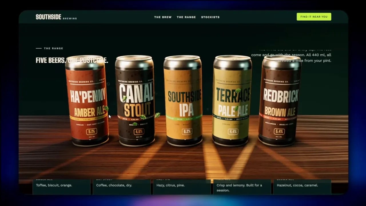
The reference was a highly interactive 3D showcase built by an award-winning design studio. It included horizontal and vertical scrolling, detailed product scenes, thermal imagery, and CAD-like visual details. The source didn’t represent a real product. It existed to show what the studio could do.
That was precisely why it was useful. By giving Claude a strong reference, I got a more finished result than I could expect from a single generic prompt. The reference established the ambition level. It made clear that the page should feel immersive, product-led, and interactive.
A coffee roaster built from three references
The second site was for a small-batch coffee roaster in Galway. Its main line was “Roasted by the Atlantic.” The opening paired elegant type with a full-screen coffee video. The page then moved into content around the brand story, Galway’s Long Walk, and a product collection that shifted into a horizontal scrolling section before returning to a conventional vertical layout.
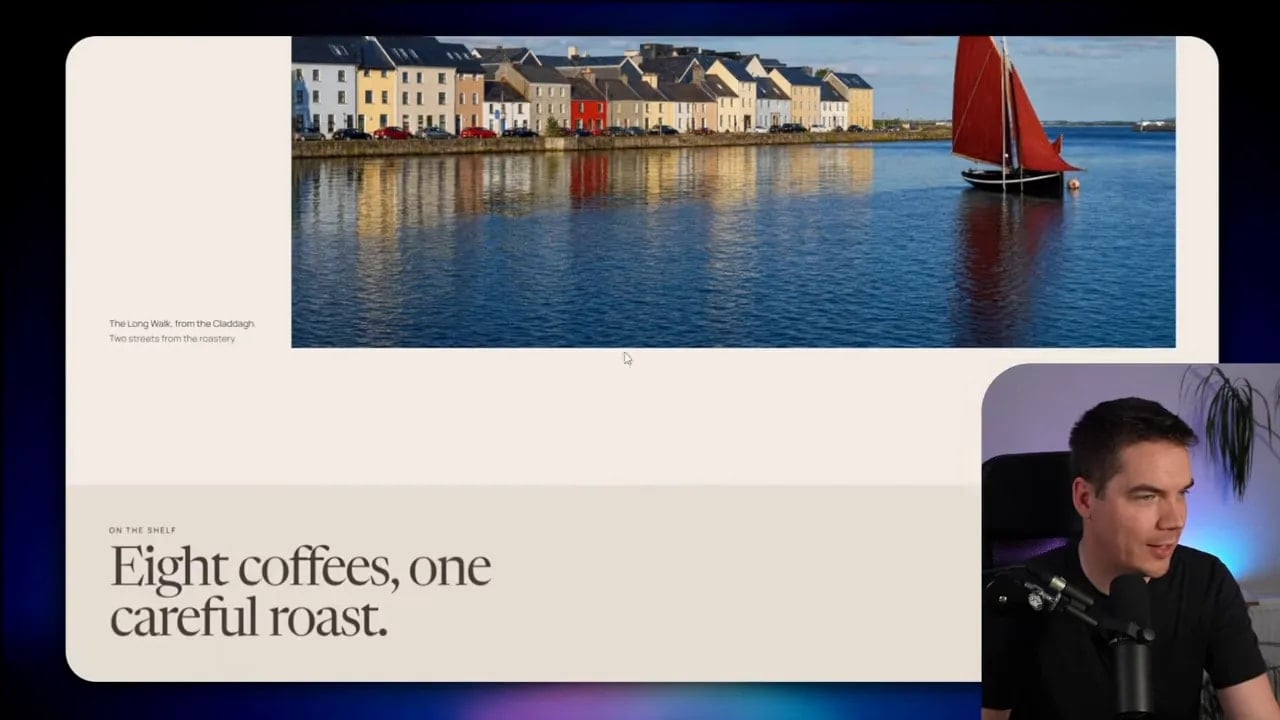
I used three references for this project, and each one had a job:
- One reference established the full-screen autoplaying video hero and its transition into the page.
- Another contributed the overall style and colour direction.
- A third supplied a storytelling approach for specific content blocks.
References don’t have to be all-or-nothing. I can borrow a layout direction from one, colour character from another, and a specific content treatment from a third. I can also be direct about what I don’t like. If a reference has an animation that feels distracting or doesn’t suit the brand, I’ll say so.
This is the habit that makes the difference: identify what is useful. Don’t simply attach a pile of images and hope Claude guesses what matters.
Six places to find design inspiration
I use six categories to collect visual direction for websites, apps, and digital products:
- Design galleries
- Real-world apps and sites
- Components
- Fonts
- Colour palettes
- Design systems
Each category answers a different design question. Some help me shape the entire journey through a page. Others help me improve one small piece that might otherwise feel generic.
1. Use design galleries for best-in-class websites
Design galleries are a great starting point when I need current, award-winning work. They give me a fast overview of what skilled studios are creating across industries and styles.
Awwwards for high-end web experiences
Awwwards showcases leading web design from across the internet. I can explore sites of the day, nominees, honourable mentions, and category-specific work. This makes it much easier to search with a real project in mind.
If I’m building an architecture website, for instance, I can filter for architecture and study relevant examples. A gallery page gives the initial inspiration, but the link through to the live site is where I can understand the full experience: large imagery, bold typography, unusual numbered lists, spacing, interaction, and structure.
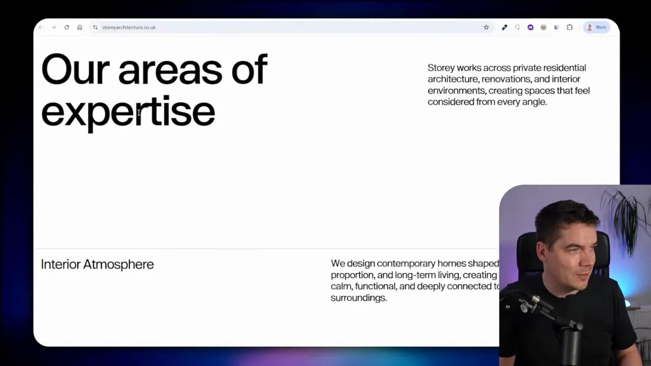
It’s important to study the page as a complete sequence. The best web design often gets its impact from the relationship between sections, not just from a single hero image.
Capture full pages when layout matters
When I find a website with a layout worth studying, I use the free GoFullPage Chrome extension. It captures a website from top to bottom and stitches the result into a single PNG or PDF.
A full-page image gives Claude the broadest possible context. It can see how an opening section flows into the next, where the page changes pace, how images and text alternate, and how a footer resolves the experience. I can paste that PNG directly into a Claude Code thread and explain the elements I want to use as inspiration.
Full-page screenshots are especially useful for:
- Landing page structure
- Content hierarchy
- Editorial pacing
- Image and text balance
- Section-to-section transitions
- Long-scroll product stories
Capture smaller images when the detail matters
A full-page screenshot is less useful if I only care about one component. In that case, I take a targeted screenshot with a snipping tool. This might be a navigation treatment, a card layout, a pricing section, an unusual heading style, or an interaction.
One striking example used the phrase “Normal is boring” in a horizontal-scroll sequence. The text changed as the page moved. After a while, the horizontal movement stopped and the layout returned to vertical scrolling. If I wanted a related effect, I wouldn’t need the entire page. I’d capture the relevant section.
Animations need extra context. One screenshot may show the start state, but not what happens next. For a motion reference, I’ll collect before-and-after screenshots, or several stages of the movement. Then I explain the transition in simple terms: what enters, what changes, how the screen moves, and when the effect should stop.
SiteInspire and Lapa Ninja
SiteInspire is another useful gallery. I can filter by style, type, subject, and platform. That makes it useful for specific needs, such as playful websites for children. In that category, I might find illustrations, small animations, and colour choices that feel appropriate for the audience without being bland.
Lapa Ninja is especially strong for landing page inspiration. It offers filters for industry, category, and colour. It also includes a motion section, which is useful for product storytelling. A carefully designed animation can explain how a physical product is built, reveal a product feature, or create a seamless entry into the rest of a page.
I look for individual patterns as well as entire pages. Perhaps a brand name stays fixed along the bottom edge of the screen. Maybe it responds to the cursor as the page moves. That’s a clear visual idea I can isolate, capture, and describe to Claude.
Design galleries are the trophy shelf. They show what is trending, award-winning, and highly polished. They help set a high visual bar.
2. Study real-world apps for practical patterns
Galleries tend to show highly curated work. For inspiration from actual products used by real companies, I turn to app and website libraries. These sources are valuable because they reveal how well-known teams handle everyday screens and user flows.
Mobbin for real interface screens
Mobbin is a large library of real app interfaces from companies such as Apple Music, Basecamp, Buffer, and many others. It contains hundreds of thousands of screens. I can browse app examples or switch to websites when I’m working on a web project.
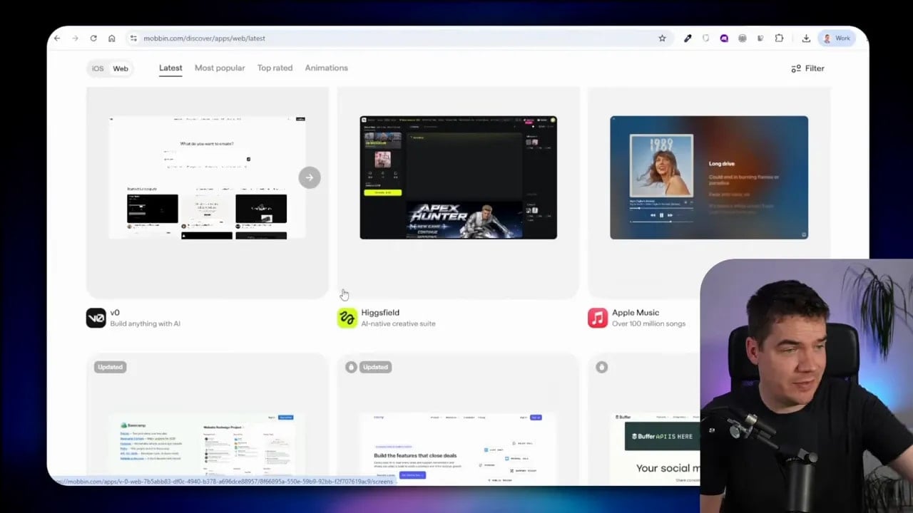
This is a good place to study a particular part of an experience. I might find an above-the-fold layout with a swirling central component, a video that starts blurred and becomes sharp, or an interface that makes complex information feel easy to scan.
The free plan provides a lot to explore. More detailed research may require a paid plan. For a focused design sprint, even a month of deeper access can be worthwhile if it helps me find strong examples for a pricing page, onboarding flow, dashboard, or checkout.
Refero for screens, flows, and design files
Refero includes web apps and iOS apps. It breaks products down into individual screens and flows. This is useful if I’m building a web app and want examples for focused tasks, such as writing a reply, sending an invitation, or setting up an account.
Refero also has a styles beta that can provide a design.md file for an AI agent. A markdown document can be helpful because it converts visual patterns into written instructions that Claude can use.
Still, a design.md file is not enough on its own. It cannot fully capture an image’s visual character or the way motion feels. When I use one, I pair it with screenshots of the actual reference. The markdown file supplies structure and direction. The screenshot supplies the visual evidence.
That combination tends to produce better results than either format on its own.
3. Improve pages with component libraries
Whole-page inspiration gives me a top-down view. Component resources work from the other direction. They let me improve a single element that needs more personality or polish.
21st.dev for prompts and React components
21st.dev provides components, templates, and themes that can be dropped into a project. If I need an animated hero section, a gallery, a call-to-action area, a map, a menu, a popover, pagination, an onboarding flow, or a sidebar, it gives me practical building blocks.
Many of these examples include a prompt that supplies Claude with the implementation context it needs. Rather than trying to explain a complex animated hero from scratch, I can copy the prompt for a component and pass it into Claude with clear instructions on how it should fit the project.
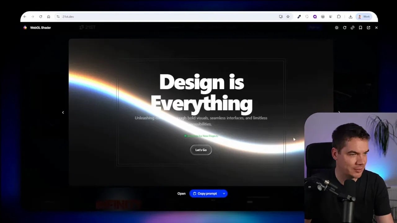
This helps because a component library does more than show a pretty result. It also points to a workable implementation pattern. That’s a fast route to better detail in a React project.
React Bits for visual effects
React Bits is another strong option for React-specific components. It includes a wide range of backgrounds and animated visual effects. A subtle background effect can take a plain section and make it feel intentional. It can also support the mood of a product without competing with the content.
I use these resources selectively. A site doesn’t improve because every section moves. It improves when motion has a purpose. A background might create atmosphere. A hover state might make an interaction clearer. A reveal might focus attention on a product feature.
The point is to use detail to support the design, not to decorate every available space.
4. Choose fonts that give the site a point of view
Typography has an enormous effect on whether an AI-built website feels considered or generic. One of the fastest tells of thoughtless AI work is the default use of Inter everywhere. Inter is a useful font, but it shouldn’t be the automatic answer for every brand.
A font can make a coffee roaster feel editorial, a brewery feel industrial, a children’s product feel playful, or a luxury service feel understated. It affects the whole personality of a page.
Use Fonts In Use to see type in context
Fonts In Use is one of my preferred places to research typography because it shows typefaces in real applications. Instead of comparing the same sample sentence on a white screen, I can see fonts on bottles, magazines, signs, badges, packaging, posters, and websites.
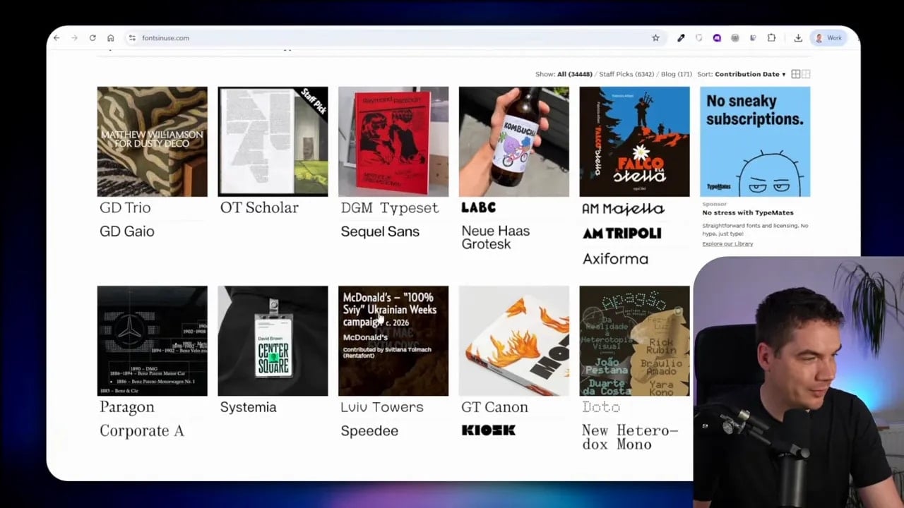
That context matters. A typeface may look ordinary in a standard font picker, then become exactly right when used on packaging or paired with a strong image. This helps me understand how a font behaves in a real composition.
Some fonts are commercial, so they require a licence. Others are free. Google Fonts is useful for free web fonts that I can embed directly in a site.
When I share a typography reference with Claude, I explain the role, not just the font name. For example:
- Use a high-contrast serif style for large editorial headings.
- Keep body text neutral and easy to read.
- Use generous line height in long sections.
- Avoid the default Inter look for headings.
- Use oversized headlines with plenty of empty space.
That gives Claude both a visual direction and rules it can apply consistently.
5. Start with an intentional colour palette
Colour is another area where AI coding agents often settle on something safe and generic. A bold, well-chosen palette can make a site feel much more distinctive.
Coolors is a useful colour resource. It has millions of palettes, a generator, trending options, and popular options. I can open a palette and give it directly to Claude, asking it to map the colours into primary, secondary, accent, background, and text roles.
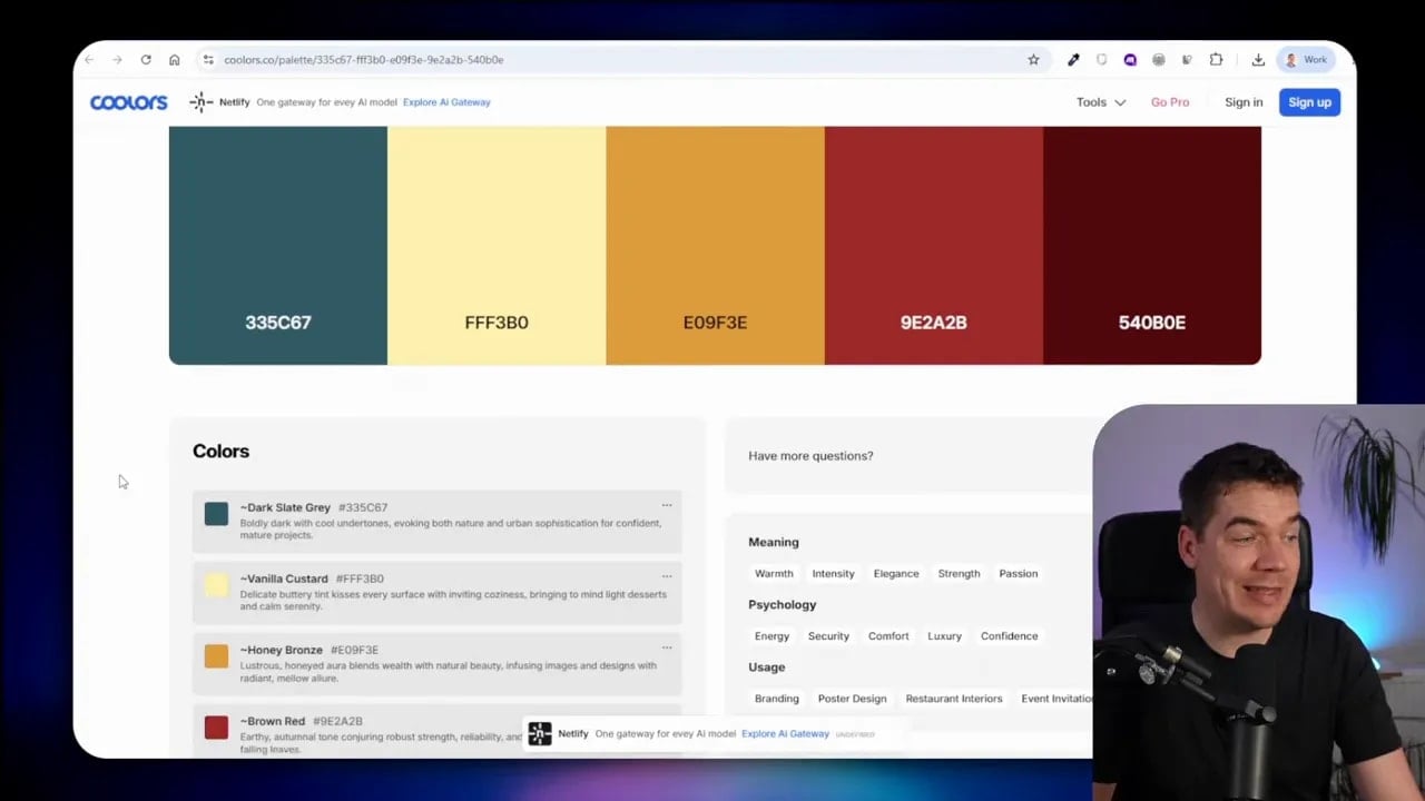
I avoid treating the most popular palettes as the safest option. Popular often means average. Instead, I use them as a starting point, then choose something that matches the project’s character.
A single palette should establish clear roles:
- Primary colour: the main brand colour used for key moments.
- Accent colour: reserved for buttons, highlights, or small visual signals.
- Background colours: used to create contrast and separate sections.
- Text colours: chosen for readability at each background level.
- Support colours: used sparingly for labels, tags, or data states.
I don’t need to use every colour at full strength. A palette works best when it creates a clear hierarchy. One dominant colour, one or two accents, and quieter supporting shades usually create a more coherent result than making every element loud.
6. Turn recurring choices into a design system
Once I’ve found a visual style that works, I don’t want to start from zero for the next landing page, app screen, slide, or printed asset. This is where a design system becomes useful.
A design system is simply a documented set of rules for how a brand looks and behaves. It can include brand principles, logo use, colours, typography, buttons, cards, spacing, page sections, imagery, and interaction patterns.
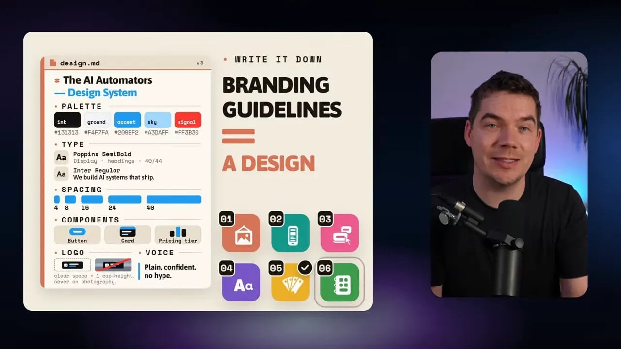
I can create a design.md file and give it to my coding agent. Then Claude can apply the same visual rules every time it creates a new artifact. That consistency matters when work moves beyond one page.
Learn from branding guidelines
BrandingStyleGuides.com is a free archive of major brand guidelines. It’s useful for studying how established companies document visual decisions. A Coca-Cola guideline document, for example, covers its design principles, colour use, approved design elements, logo variations, and language considerations.
I don’t need a 67-page document for every project. The point is to see how design rules can be made clear. If I admire a premium brand such as Mercedes-Benz, I might study how it uses silvers, chrome-like details, product imagery, typography, and space. Then I can use those observations to shape a fresh direction for a different project.
I’m not copying the identity. I’m learning how to turn visual taste into reusable decisions.
What to put in a practical design.md file
Once I have screenshots, font choices, and a colour palette, I can ask Claude to create a design system. A useful design.md file might include:
- Brand personality: three to five clear words that describe the intended feeling.
- Colour tokens: named primary, background, text, border, and accent colours.
- Typography rules: heading font, body font, weights, sizes, and line-height guidance.
- Spacing rules: a consistent scale for gaps, padding, and section spacing.
- Button styles: default, hover, secondary, and disabled states.
- Card and panel styles: border radius, shadows, backgrounds, and internal spacing.
- Image direction: preferred crop, contrast, mood, and placement.
- Motion rules: where animation belongs and where it should be avoided.
- Accessibility rules: contrast, focus states, readable body text, and sensible interactions.
My own AI Automators design system covers branding, logos, colours, buttons, feature areas, pricing cards, testimonials, and typography. Once that document exists, I can ask Claude Code or Claude Design to use it for the next artifact. The result is far more consistent than starting from a blank prompt every time.
Bring references into Claude with clear instructions
Great references are only half the process. Claude also needs a clear brief. I don’t paste a screenshot and write “make this.” I explain the visual decisions I want it to learn from.
A strong request can include:
- The goal of the new page or product
- The target audience and brand personality
- The reference screenshots or full-page captures
- The specific features to use as inspiration
- Parts of the references to avoid
- Required content sections
- Typography and palette decisions
- Interaction or animation requirements
- A request to review and improve the result after the first version
For example, I might say that I want the spacing, oversized headings, image scale, and editorial pacing from a reference. I might also say that I don’t want its overactive transitions, exact colours, or navigation treatment.
That’s enough to set a direction without asking for imitation.
Use an iterative quality loop
I don’t expect the first result to be perfect. The goal is to give Claude enough information to produce a strong first pass, then keep improving it. I can ask it to compare the output to the reference criteria, identify where it still feels generic, and make targeted changes.
Useful follow-up instructions include:
- Increase the whitespace and reduce the number of visible elements.
- Make the typography more editorial and less like a standard SaaS page.
- Use the palette more selectively and reserve the accent colour for key actions.
- Improve the hierarchy of the hero section.
- Replace generic cards with a more distinctive content layout.
- Add only one purposeful motion effect to the opening section.
- Check that the new page follows the existing design system.
This loop matters because design quality rarely arrives in a one-shot prompt. The first version gives me something to react to. Each pass gets more specific.
Use inspiration beyond curated design sites
Inspiration doesn’t need to come from a web design gallery. Once I understand the process, almost any visual source can become input for Claude.
Pinterest for broad visual exploration
Pinterest is useful because it covers far more than websites. It includes print, illustrations, photography, interiors, packaging, colour, digital art, and more. If I search for “lakeside cabin website,” I can quickly find visual directions for a cabin brand.
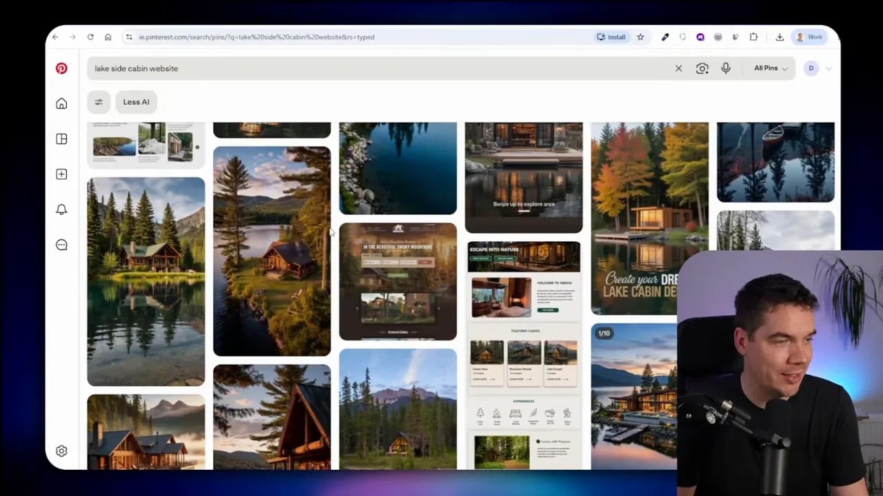
Maybe I find a warm timber palette, misty forest photography, a quiet editorial layout, or an unusual way to display availability. I can extract the useful elements, take screenshots, and explain the feeling I want to preserve.
Negative direction is just as valuable here. I’ll note what should be avoided, such as overly rustic clichés, too much dark overlay, excessive animation, or a crowded booking interface.
Tools.design for a wider resource library
Tools.design is a directory of design resources and tools. It includes both free and paid resources, and it’s useful when I want to discover something outside the usual gallery sites.
One example is Book of Shapes, which offers customisable SVG patterns. A pattern can become a memorable hero artifact, a section background, or a small visual detail that brings a page together.
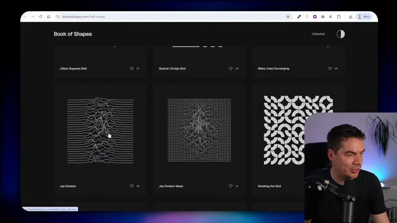
One well-chosen visual element can give a site a much stronger identity. The limit is mostly the quality of the references and the clarity of the direction.
A simple process I use for every AI design project
I use the same broad sequence whether I’m creating a marketing site, a product page, or an app interface.
- Define the purpose. I write down what the page needs to achieve and who it is for.
- Collect references. I gather whole-site examples, specific components, font references, palettes, and app screens.
- Label what I like. I identify the exact reason each reference is useful.
- Label what I don’t want. I call out patterns that would weaken the project.
- Capture the right format. I use full-page screenshots for overall structure and cropped screenshots for individual details.
- Create a short visual brief. I combine brand mood, type, colour, layout, and motion instructions.
- Give Claude the evidence. I attach the screenshots, URLs where useful, and any existing design.md file.
- Generate a first version. I treat it as a draft, not the finish line.
- Review against the brief. I check hierarchy, spacing, typography, colour, interaction, and consistency.
- Iterate until it reaches the bar. I make targeted changes rather than resetting the entire project.
The gallery ends once I choose a reference. The real work starts when I turn that inspiration into a clear visual brief and use it to guide the build.
A website made with Claude doesn’t have to look like the average of a million sites. Give it strong examples. Tell it precisely what to learn from them. Keep the brand rules consistent. Then let it iterate until the finished work feels intentional.
For a collected list of the design galleries, component libraries, type resources, colour tools, and other references covered here, I’ve put them together in this design inspiration resource list.
