
Every site, tool and prompt from the video, in the order it appears.
Want to build real things with Claude Code? Join The AI Automators community for our Claude Code / Codex Masterclass, our AI Builders course and live workshops each week.
The three sites, their references and the prompts
Each page came from one prompt, run as a gauntlet loop (Matt Shumer’s guide) with the frontend-design skill, followed by a round or two of fixes. The prompts are below each site.
Southside Brewing
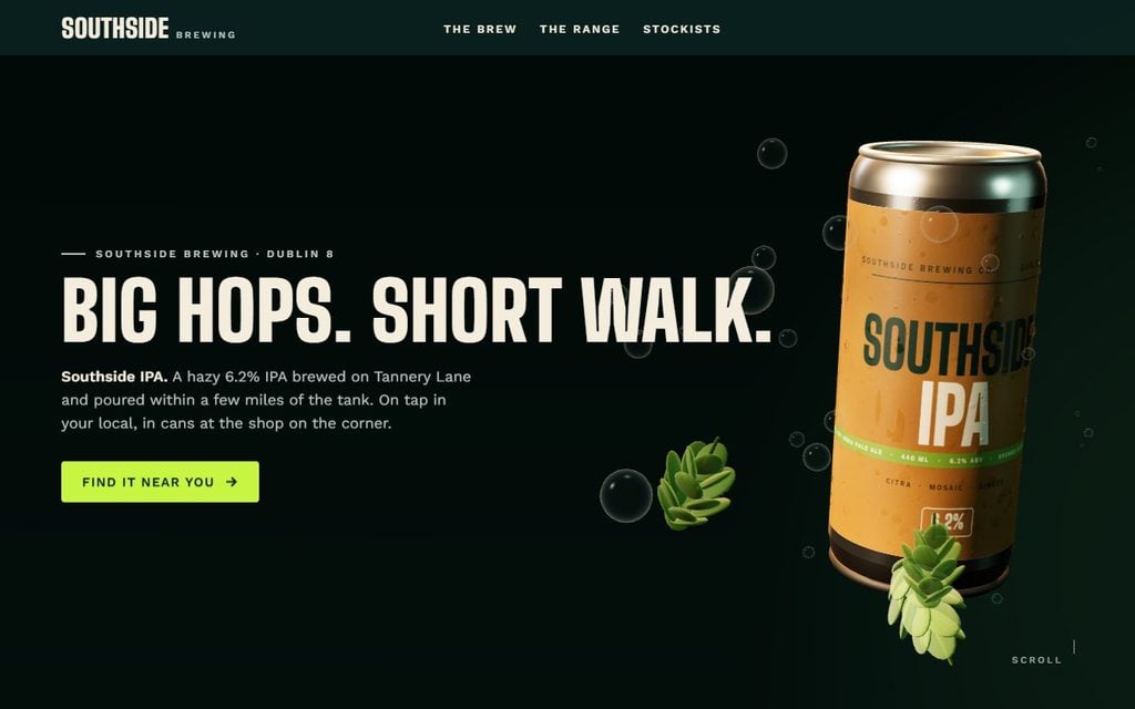
Reference: Oryzo by the studio Lusion, for the scroll-driven 3D motion.
The Prompt
Here is a reference site: https://oryzo.ai/ Study how it moves as you scroll. I want that level of polish and motion, but I want my own object, my own colours and my own layout. Do not copy the site.
Build a one-page landing page for Southside Brewing, a small local brewery, and its flagship beer, Southside IPA, sold in cans at local pubs and shops. The goal is to get people to find a pub or a shop near them that stocks it.
I want this to be in 3D. Use Three.js, loaded from a CDN with a pinned version. Build the can in code from primitives: a 440 ml cylinder body, two torus rims, a slightly domed top with a pull tab, and a label drawn on a canvas texture with the brand name “SOUTHSIDE” in a big bold condensed display font, the word “IPA” below it, a thin band of hop green, and “6.2%” in small type near the base. Do not use any external 3D model files or image files. Use a metallic PBR material with soft reflections and a light film of condensation, a three-point studio light, and a warm environment so the can looks like a real photo.
Motion: the can orbits slowly on its own. The mouse tilts it a little. Scroll rotates it and moves the camera through three scenes: the hero; a “the brew” scene where the can tilts and three tasting notes (hazy, citrus, pine) appear one by one; and a “find it on tap” scene where the can settles on a wooden bar top. Add transparent layers in front of the can, in this case hop cones and drifting foam bubbles built from simple meshes, with a parallax effect. I want layers that are transparent. I want them in front. I want them to orbit. I want them to have a parallax.
Layout: HTML text sits on top of the 3D canvas. Hero: a big headline, one line, one button that says “Find it near you”. The brew: three short cards that light up as each tasting note appears, plus the ABV and the hops used. Find it on tap: a short list of pubs and shops with a postcode search box slot. A simple footer with the brewery address.
Visual world: bold and crafty, like a taproom on a Friday evening. A deep teal-green background, a hazy amber can, warm off-white text, and one bright hop-lime accent used only on buttons, links and the ABV. No purple. No gradients in the UI. One bold condensed display font for headings, one clean body font, body text 16 to 18 px. Do not use Inter, Roboto or Open Sans.
Copy: confident and short, written for local craft beer drinkers and the pubs that serve them, not for supermarkets. One ask per screen: find it near you. Make up all the text, imagery, logos and details you need. Show the wider range too: IPA, amber ale, stout, pale ale, brown ale.
Performance: keep the whole page under 1 MB. Cap the pixel ratio at 2. Respect prefers-reduced-motion by stopping the orbit and the parallax. If WebGL is not available, show a static teal hero with the headline instead of a blank canvas.
Self-verify until it is perfect: take screenshots at the top, at each scene, and at the bottom, on desktop and on a phone size, and fix anything that is cut off, unreadable or jerky before you report back.
Use the image and video generators available to you. Use sub-agents on Opus where it helps. Run this as a gauntlet loop for the best result.
Harbour Lane Coffee
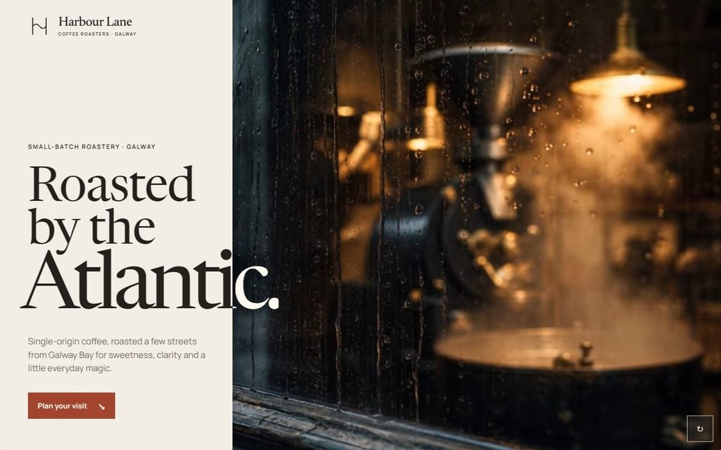
References, pasted as screenshots: Café Technica for the video hero, La Colombe for the style and colours, Anna Jóna for the storytelling sections.
The Prompt
I have pasted three screenshots of websites I like. This is the vibe I am going for. Analyse them and understand my design taste before you build anything.
What I like in each one:
– Site 1 (Café Technica): the full-screen autoplaying video hero that scrolls horizontally to become full screen, and then the page continues vertically.
– Site 2 (La Colombe): the style and colour scheme. The blues and reds, the big images and the cards.
– Site 3 (Anna Jóna): the transitions and the storytelling, and again the big type, visuals and colours. I do not like the animations on this one.
Do not copy any of these sites. Take inspiration from them only.
Build a one-page landing page for Harbour Lane Coffee, a small specialty coffee roaster in Galway. The goal is to get local people to visit the shop and buy a bag of beans.
Layout, top to bottom: a full-viewport hero with one strong image and a short tagline; a short brand-story section; a section showing three coffees in a clean grid, each with a name and one line; a “visit us” block with the address and opening hours; a simple footer. Above the fold needs an embedded video like site 1, so use the video generator with a start frame and an end frame. Add a horizontal scroll on the coffee bags too, and produce two more products.
The brand is warm, crafted and slightly premium: single-origin coffee roasted in small batches. Keep the copy in that voice. The audience is local coffee lovers who care about quality and craft, not a big chain. Make up any details you need and create an appropriate logo.
Design rules: one serif display font for headings and one clean body font, body text 16 to 18 px. Do not use Inter, Roboto or Open Sans. Most of the page is neutral: an off-white background like heavyweight uncoated paper, deep charcoal text, and one warm terracotta accent used only on buttons and links. No gradients. Use an 8-point spacing system. White space is the primary design directive. Give every element room to breathe. Do not centre everything down the middle of the page.
I will supply the real photos. Leave clear image slots for the hero and the coffees. Use subtle fade-up reveals as sections enter. Nothing springy.
Use the /frontend-design skill. Build it as a single HTML file. When you are done, check your own work for quality, readability and good UX, and make sure it works on a phone. Before you start, ask me any questions you need answered.
Run this as a gauntlet loop for the best result.
Blackwater Cabins
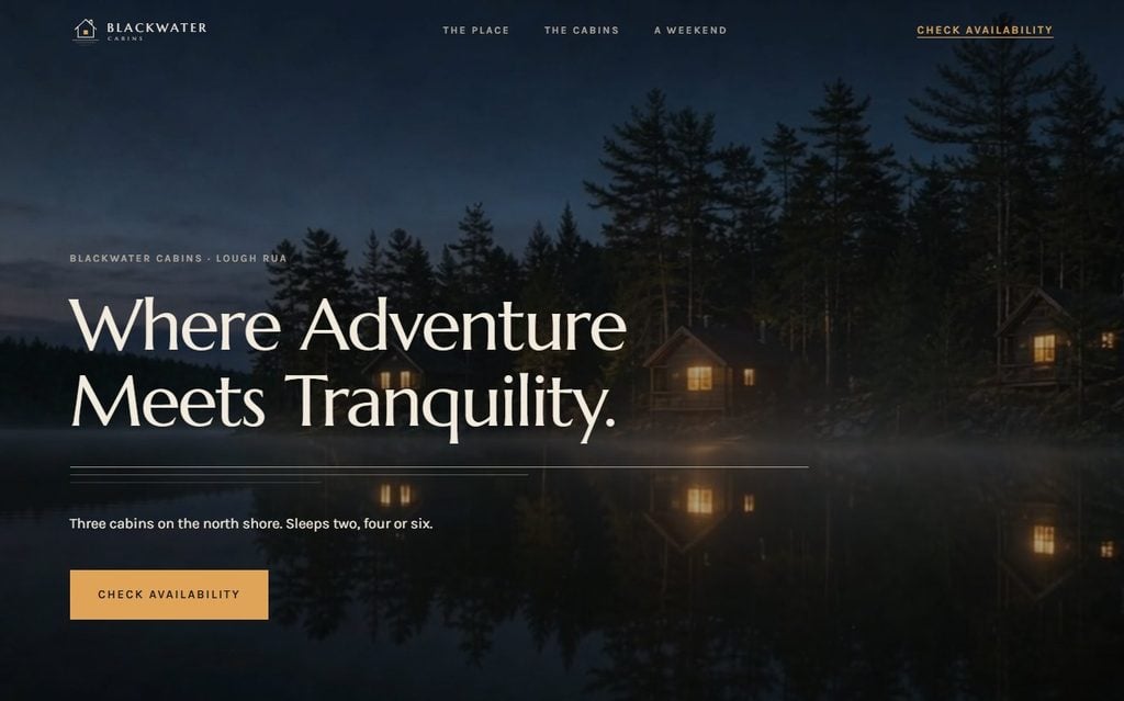
References, sent as links: Nimmo Bay for the hero, Vipp Guesthouses for the dark feel and sticky nav, Aman Amangiri for the cards.
The Prompt
Look at these three websites before you build anything:
– https://www.nimmobay.com I love the full-bleed photo hero and the way the headline sits low in the corner of the image, with thin, wide-tracked type. I do not want its colours or its font.
– https://vipp.com/en/world-of-vipp/our-guesthouses I like the dark, high-contrast feel and the thin navigation bar that stays with you as you scroll.
– https://www.aman.com/resorts/amangiri I like the cards with one large photo each, a small eyebrow label, a serif title, and a lot of space around them.
Do not copy them. Use them as inspiration for the layout and the feel only. Use my own logo, which is attached.
Build a one-page landing page for Blackwater Cabins, three lakeside cabins for weekend stays. The goal is to get visitors to check availability and book.
Layout, top to bottom: a full-viewport photo hero with the headline low left and one button; a short “the place” section with one large image and two short paragraphs; a cabins section with three cards, each with a photo slot, a name, sleeps how many, and a price from; a “what a weekend looks like” section with four small icons and one line each; one guest quote with a name; a booking section with the same button; a simple footer.
Visual world: dark, cinematic and quiet, like arriving at a lake at dusk with the cabin lights on. Deep charcoal backgrounds, warm off-white text, and one amber accent that feels like lamplight through a window. The amber appears only on buttons, links and prices. No purple. No gradients.
Typography: one elegant serif display font with wide letter-spacing for headings, one clean body font, body text 16 to 18 px. Do not use Inter, Roboto or Open Sans.
Motion: slow scroll-reveal on each section, a gentle parallax on the hero image, and a sticky navigation bar with a subtle blur. Keep it tasteful and slow. Alternate one animated section with one calm section.
Copy: calm and specific, written for couples and small families who want a quiet weekend. The audience is not adventure tourists. One ask per screen: check availability.
Use the available image model and video model to generate appropriate assets.
Use the /frontend-design skill. Build it as a single HTML file. When you are done, take screenshots at the top, the middle and the bottom of the page, check that all text is readable on the dark background, and make sure it works on a phone. Ask me any questions first.
Use sub-agents on Opus where it helps. Run this as a gauntlet loop for the best result.
Capturing a reference
- GoFullPage: free Chrome extension, whole page to one PNG.
- Snipping Tool (Windows + Shift + S, or Command + Shift + 4 on a Mac): one component, or a before and after of an animation.
- Claude Code or the Claude Desktop app: paste the screenshots in, say what you like and what to avoid.
1. Design galleries
- Awwwards: sites of the day, nominees and honourable mentions, filtered by category or feature (Architecture, 360). In the video: Storey Architecture, Normal Is Boring, the Louisiana Governor’s Mansion tour.
- Siteinspire: filter by style, type, subject and platform. In the video: Lang Mobile from Children.
- Lapa Ninja: landing pages, with filters for colour, industry and category, and a Motion section. In the video: Sharplink.
2. Real-world apps and websites
- Mobbin: 600,000+ real screens, split into Apps and Sites. Free plan, or about $10 a month at the time of recording for the full library. Mobbin MCP lets Claude search it. In the video: Cosmos.
- Refero: real web and iOS apps as screens and flows. Refero Styles gives you a design.md per style; pair it with a full-page screenshot (in the video, Stripe).
3. Components
- 21st.dev: components, templates and themes with a Copy prompt button. In the video: the WebGL shader hero and the animated scroll gallery.
- React Bits: animated components and backgrounds.
4. Fonts
- Fonts In Use: fonts on real objects. Some are commercial. In the video: Albra.
- Google Fonts: free and embeddable. Avoid Inter.
5. Colour
- Coolors: 10 million+ palettes and a generator. Browse what is trending, skip the most popular. In the video: this palette.
6. Design systems and brand guidelines
- Branding Style Guides: real brand guideline PDFs. In the video: Coca-Cola and Mercedes-Benz. Start with the most popular.
- Refero Styles: a ready-made design.md per style.
- Claude Design and Claude Code: once the look is nailed down, ask Claude to write it up as a design system and reuse it for every artefact.
Bonus
- Pinterest: search your subject plus “website” (in the video, lakeside cabin website).
- toools.design: a directory of design resources, tagged free or paid.
- Book of Shapes: customisable SVG patterns.
Watch next
- Fable 5.1 + Claude Code /design (Beginner’s Guide): the Claude Design canvas in the Desktop app, and from the Claude Code terminal.
Want the masterclass on Claude Code and Codex, and the AI Builders course? Join The AI Automators.
