
Fable 5.1 is Anthropic’s strongest model yet for coding and design, and the /design command gives Claude a full visual canvas inside the Claude desktop app. I can also trigger the same workflow from Claude Code in the terminal.
That sounds like a shortcut to great design. It isn’t, at least not by itself.
If I type a simple request such as, “Create three A4 price lists for a mobile car valet business,” Claude can certainly produce something usable. Yet it will often look like the same safe, generic AI work that appears everywhere else.
Professional results come from steering the model. I need to give it a visual direction, useful assets, proper critique, and a system it can follow over time.
I used a fictional mobile car valeting and detailing service called Auto Blitz to test the full process. Starting with a basic brief, I created branded price lists, a how-it-works flyer, a review card, an Instagram post, and a landing page with generated imagery and a 360-degree AI video.
What Claude /design Actually Gives You
Inside Claude desktop, I type /design and give Claude a prompt. The result appears on a canvas made up of artboards, much like a lightweight design workspace.
For example, I can ask for three A4 price lists for Auto Blitz with three packages:
- Express
- Full Valet
- Ceramic
Claude can create several variations in one go. Each variation receives an artboard name, and that matters later because I can tell Claude exactly which version I want to continue editing.
The first output is usually structurally fine. It contains the packages, prices, headings, and buttons. However, it often lacks the character that makes a small business look distinct.
The canvas lets me make quick edits by hand. I can duplicate an artboard, zoom around the page, select a text block, change its font size, adjust colour, alter padding, and edit content. This is helpful for small amendments.
It does have a different feel from Figma. The canvas works through HTML and CSS, so I can’t treat every element as a fully freeform object that I drag anywhere I like. That is not really the point. I use the properties panel for minor adjustments, then I ask Claude to make larger layout or design changes.
One important habit is easy to miss: save changes after editing in the canvas. Until I save, Claude can’t use those edits as part of the next instruction. A small manual adjustment that is not saved is effectively invisible to the rest of the workflow.
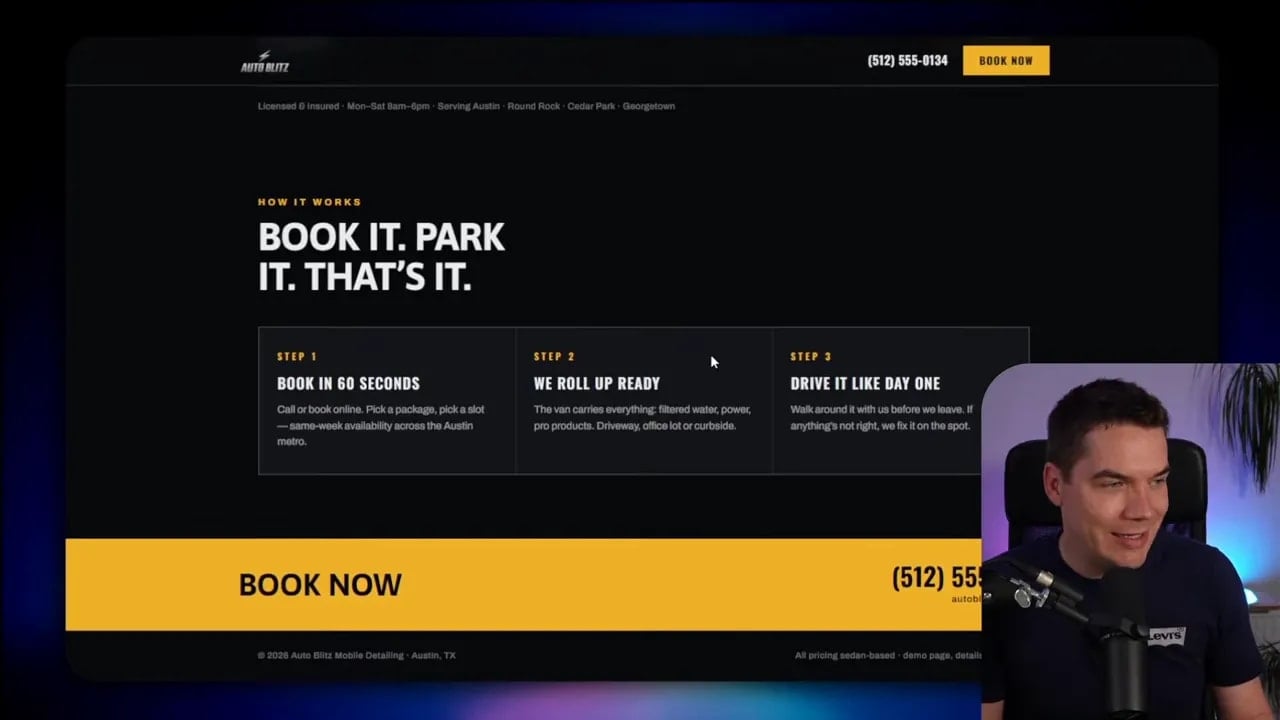
Spotting the Generic AI Design Look
Before improving a design, I need to recognise why it feels average. There are five common tells.
1. Safe typography
AI often reaches for a safe system-style font, frequently something close to Inter. It is readable, but repeated use makes unrelated brands look remarkably similar.
2. Default colour choices
Without direction, the model selects a palette for me. For a long time, that often meant a purple gradient. The problem is not purple. The problem is that the design has no connection to the business it is supposed to represent.
3. Missing or placeholder imagery
If I do not provide images or ask for image generation, a design may contain no photography at all. It may use gradients or generic blocks where a strong visual should sit.
4. Weak hierarchy
Hierarchy tells someone where to look first, second, and third. Generic layouts often make every headline, price, label, and callout compete at the same volume.
5. Inconsistent spacing and composition
Designs need room to breathe. Crowded groups, uneven alignment, and unclear sections make even good colours and imagery feel less polished.
Every technique below addresses one or more of these issues.
Technique 1: Give Claude Something to Look At
This is the biggest improvement I can make with the least effort. Instead of asking Claude to invent a visual identity from a sentence, I give it references.
References can include posters, advertisements, websites, printed brochures, product packaging, photography, layouts, or an interesting colour treatment. I am not asking Claude to copy them. I am giving it a style guide so it can understand the flavour I want.
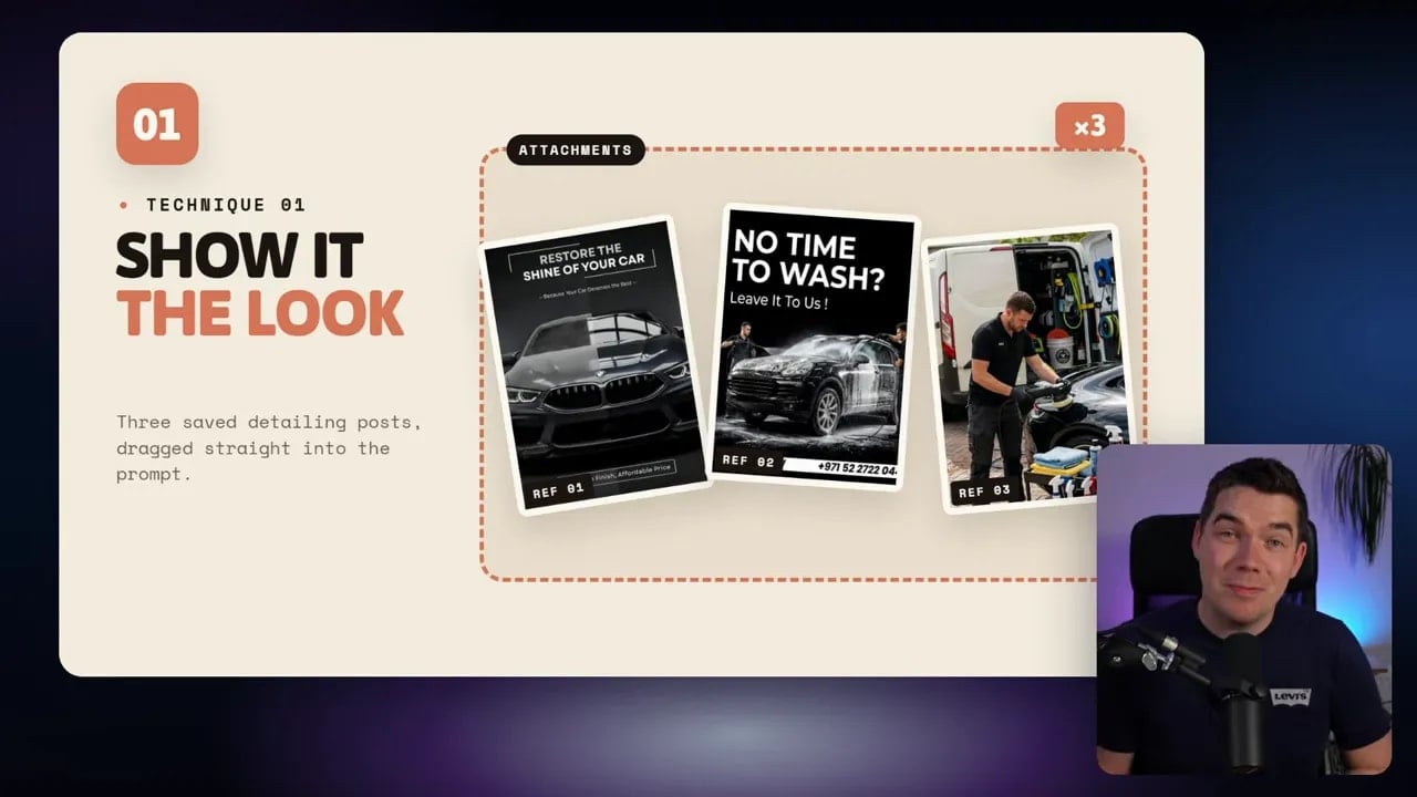
For the Auto Blitz work, I used examples with dramatic automotive photography, bold type, split compositions, and a premium detailing feel. I also included an image that was simply a useful car photograph. A visual does not need to be a finished design to help. It can guide image generation just as effectively.
There are several good sources for this:
- Pinterest for print and digital inspiration.
- Savee for design-focused collections and compositions.
- Dribbble for web design, branding, typography, illustration, and interface ideas.
Once I find references, I take screenshots and paste them into the Claude thread. Then I make the request more specific: create three A4 price lists in the style of the attached references, with a logo and appropriate imagery for the brand.
The difference is immediate. The results no longer start from the same generic visual assumptions. Claude borrows the mood, composition, contrast, and energy of the references without directly recreating them.
After that first pass, I choose a direction. I may like the typography from one artboard, the photographic treatment from another, and the pricing structure from a third. Claude can merge the strongest parts into a new version.
Alternatively, I can pick one artboard and develop it further. The key is to reference the artboard by name, rather than saying something vague like “the one on the left.”
Technique 2: Use Claude Code Tools for Images and Video
Claude Code gives me much more than a design canvas. It can create tools, connect to APIs, work with files, and bring image and video generation into the design process.
That changes what is possible. Rather than settling for placeholder visuals, I can ask Claude Code to build a small tool that creates images with GPT Image 2 through the OpenAI Platform.
The request can be simple: build me a small tool that generates AI images using GPT Image 2. Claude can inspect the documentation, write the code, and ask me for an API key.
I create the key in OpenAI Playground, store it in a .env file, and then use the new tool from Claude Code. OpenAI works on a pay-as-you-go basis, so I need to keep that usage in mind.
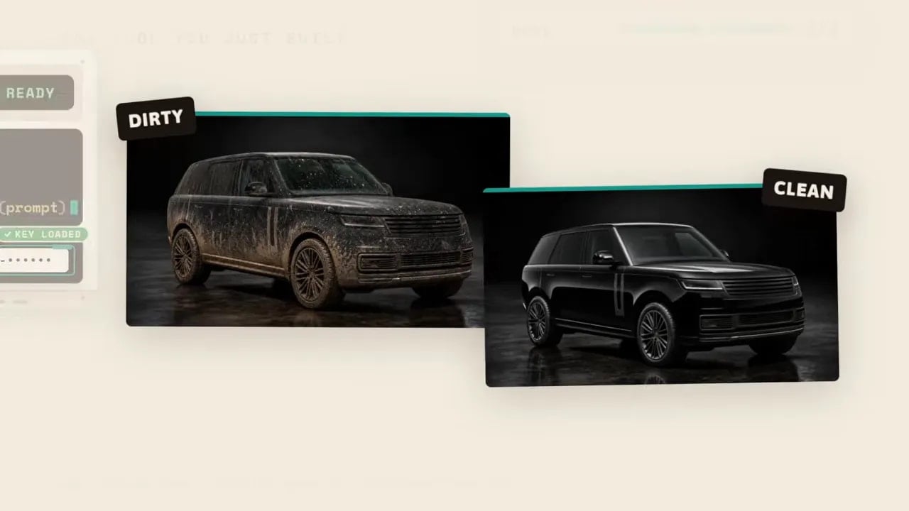
For Auto Blitz, I asked for two matching images of the same Land Rover Defender:
- One car dirty and ready for treatment.
- The same car detailed, protected, and clean.
Matching before-and-after images are particularly useful. They can support a price list, appear in an Instagram post, or provide the opening and closing frames of a video.
Turning two images into a process video
I then asked Claude Code to build a video tool using Seedance 2.5 through Replicate. Replicate provides access to several image and video models through one platform, again on a pay-as-you-go basis.
The prompt needs more than a start image and end image. I need to explain what should happen in the middle.
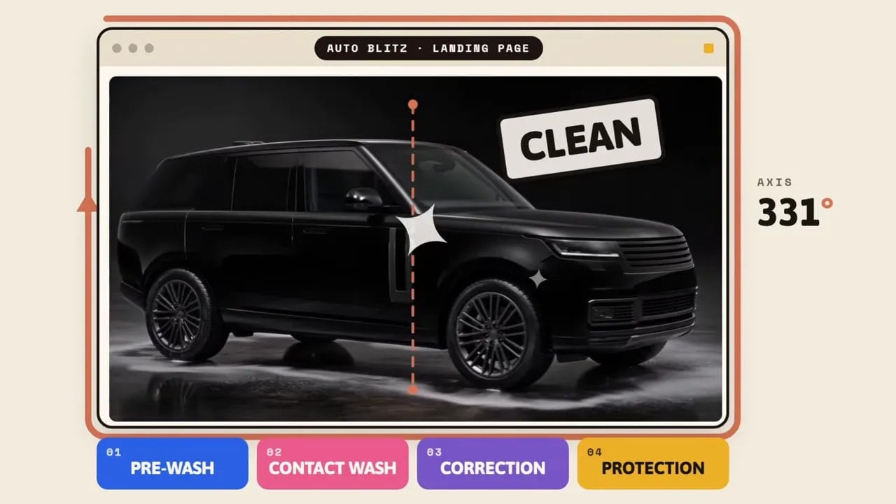
For the Auto Blitz landing page, I specified a 360-degree rotation that cleaned the car stage by stage:
- Pre-wash
- Contact wash
- Correction
- Protection
- Land exactly on the clean end frame
That level of instruction matters. The model has ten seconds or so to create a coherent sequence, so I have to describe the visual story rather than hoping it infers one.
The resulting video is not perfect. AI video still benefits from iteration. Yet it creates a visual explanation of the service that static images cannot match.
I embedded the result beneath the landing-page hero section as a scrub-scroll interaction. As someone scrolls, the video advances through the cleaning process. It turns the stages of a valet service into something much easier to understand.
Technique 3: Use Proper Icons Instead of Asking for Icon-Like Images
Icons can improve both printed pieces and digital interfaces. They make a process easier to scan, add visual rhythm, and break up dense blocks of text.
There is one important difference between icons and general design references. Screenshots do not work especially well for icon use. A screenshot can tell Claude the broad style, but it does not give it clean, reusable icon files.
For icons, I want the actual SVG files or an icon library. Lucide is a useful option. It offers a large library of clean icons that Claude Code can use in a design.
A simple instruction can do the job: “Make better use of iconography in this design. Please use the Lucide icon library.”
I can also ask Claude Code to create custom icons or generate icon concepts with an image model. That is useful when a standard library feels too plain for the visual direction.
In the Auto Blitz example, icons helped communicate stages such as washing, correction, protection, booking, and reviews. The goal is not to add icons everywhere. The goal is to use them where they reduce effort and reinforce the content.
Technique 4: Bring in a Ruthless Creative Director
There is a major flaw in any AI design workflow: the same model that made the work is often asked whether the work is good. That is like marking your own homework.
I fix that by creating a separate critique pass. Better still, I use a model from another family. If Claude created the artwork, I can use a GPT model as the critic. I can also create a new thread or ask Claude to make a sub-agent with a fresh context window.
The fresh context matters. I do not want the critic to inherit every decision and explanation that led to the original design. I want fresh eyes.
I also give the critique agent a strong role. This is not a polite assistant that congratulates the work. It is a creative director whose job is to find the flaws before the design goes out into the world.
A useful prompt looks like this:
You are acting as a ruthless creative director. Argue that these designs are not good enough to publish. Identify the three weakest areas and give specific fixes for each one.
The words ruthless and not good enough to publish are intentional. If I ask for generic feedback, I will often get generic praise. If I state that the design is already failing, the agent has to find real issues.
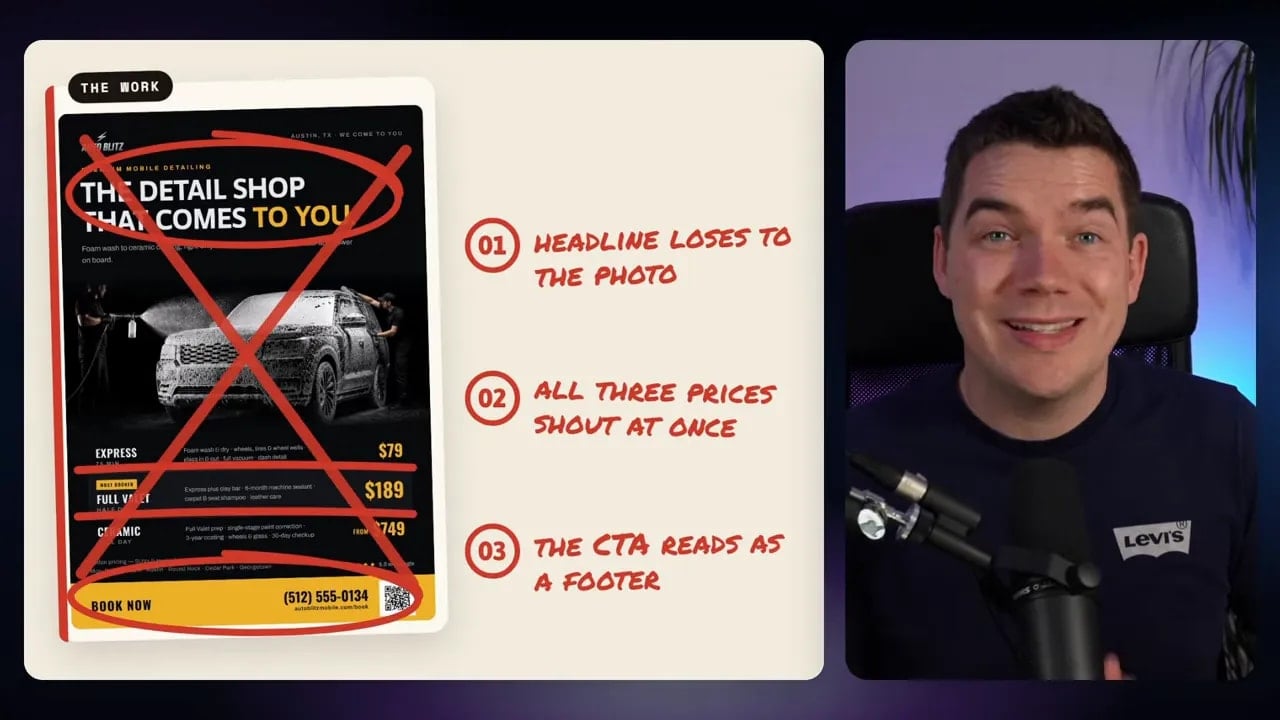
In my price-list example, the critique suggested highlighting the most booked package. That gives the customer a clearer decision path. It also suggested a QR code because this was a printed price list, where a quick route to booking makes sense.
The Instagram post produced another useful correction. A phone number was included in the first version. People do not generally copy phone numbers from an Instagram post, so the call to action changed to “link in bio.”
These are small changes, but small practical errors can make polished graphics less effective. Once the critique returns, I tell Claude to apply the useful fixes to the relevant canvas artboard.
Technique 5: Turn Strong Work into a Design System
After I create several good assets, I do not want future designs to start from scratch. If I request a new flyer next week and it suddenly uses pastel gradients, rounded purple cards, and unrelated imagery, the brand starts to drift.
The answer is to codify the work into a design system.
I begin a new Claude Code thread, point it at the existing artboards and assets, and ask it to create a design system based on them. This turns the best decisions from the project into a usable house style.
For Auto Blitz, the design system includes five key sections:
- Foundations: background colours, accent colours, contrast rules, and general visual principles.
- Type: headline and body font choices, sizing direction, weights, and hierarchy.
- Marks: logo versions and guidance for their use.
- Components: reusable price cards, process steps, review cards, buttons, and calls to action.
- Assets: generated photography and guidance on which images match the house style.
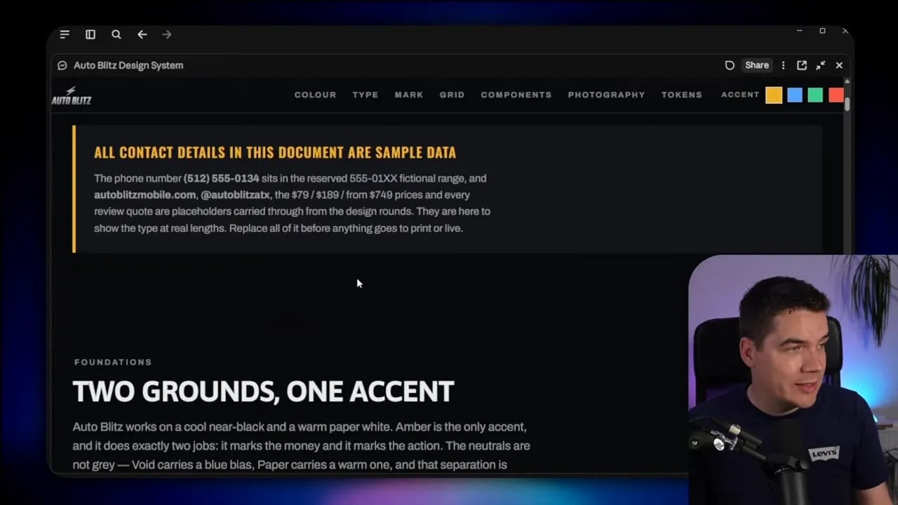
The system should guide future work without making every asset identical. A good design system gives enough consistency to make the brand recognisable while leaving room for a new landing page, a new social post, or a new printed offer to have its own purpose.
Claude Code can sync this system to Claude Design using the /design sync command. Once it is synced, I can choose that design system when creating artwork in the app. Other people working on the brand can use the same system too, which reduces visual drift across the work.
That is where this changes from a few attractive AI graphics into a repeatable content engine. The price list, flyer, review card, social post, and website do not simply look good independently. They look like they belong together.
Technique 6: Manage Tokens Before Design Work Gets Expensive
Design tasks can use a lot of tokens. Long conversations, repeated design revisions, multiple image prompts, critique passes, and large artboards all add up.
I use a few practical habits to keep usage under control.
Bundle small changes into one request
Instead of making one adjustment at a time, I collect small edits and send them as one prompt. For example, I might ask Claude to increase the heading contrast, highlight the Full Valet package, add a QR code, change the Instagram call to action, and tighten the spacing around the price rows in a single pass.
This reduces the number of times Claude needs to reread the conversation and inspect the design. It also gives me a better chance of benefiting from prompt caching.
Make simple canvas edits by hand
If I only need to adjust a word, make a line bold, or change a colour slightly, I do it directly in the canvas. Then I save. There is no need to spend a full model request on a five-second manual change.
Use the right model and effort level
I do not need the highest setting for every task. Fable 5.1 in Ultra Code mode may be useful for heavier work, but it is not always necessary for a short copy adjustment or a simple visual refinement.
Choosing a lighter model or lower effort level for smaller jobs can protect the plan for the work that genuinely needs more reasoning.
Watch the context window
I keep an eye on how much context the session has consumed. Once a thread grows very large, it can burn through usage faster. I try to keep a project under roughly 200,000 to 300,000 tokens where possible.
When a thread becomes overloaded, I start a fresh one with the files, artboards, design system, and a clean briefing. A new thread often improves both efficiency and clarity.
A Practical Workflow for Branded AI Design
I use the six techniques as a repeatable sequence rather than isolated tricks.
- Start with a plain brief. Define the asset, business, format, packages, and essential content.
- Add visual references. Supply screenshots that show the mood, composition, type treatment, and image style I want.
- Generate several directions. Ask for variations, then name and select the artboard worth developing.
- Create relevant imagery. Use image tools to generate visual assets that fit the brand and the specific service.
- Add video where it tells a story. Use matching opening and closing images, then describe the motion and stages between them.
- Use SVG icons and libraries. Treat icons as functional assets, not as an afterthought.
- Run a critical review. Use a fresh model or context, assign a creative-director role, and demand specific fixes.
- Build the design system. Capture the strongest choices in foundations, type, marks, components, and assets.
- Sync and reuse the system. Keep future work aligned without repeating the entire creative process.
- Control token use. Bundle edits, use the canvas for small changes, and avoid oversized sessions.
The difference between generic AI design and professional-looking work is rarely a longer prompt alone. It comes from giving the model good visual inputs, clear constraints, useful tools, an honest critique process, and a reusable system.
Fable 5.1 and Claude Code make the production side much faster. The real advantage comes from directing that speed with intention. Once I do that, I can take a small business from a simple service description to a complete, coherent visual identity across print, social media, web design, imagery, and motion.
